
Update: We posted the results from parts 1 through 8 as a Social Science Research Network (SSRN) working paper in pdf format:
Safe Withdrawal Rates: A Guide for Early Retirees (SSRN WP#2920322)
Welcome back to our safe withdrawal rate series! Over the last two weeks, we already posted part 1 (intro and pitfalls of going beyond a 30-year horizon) and part 2 (capital preservation vs. capital depletion). Today’s post deals with yet another early retirement pet peeve: safe withdrawal rates are likely overestimated given today’s expensive equity valuations. We wrote a similar piece about this issue before, but that was based on cFIREsim external simulation data. We prefer to run our own simulations to be able to dig much deeper into this issue.
So, the point we like to make today is that looking at long-term average equity returns to compute safe withdrawal rates might overstate the success probabilities considering that today’s equity valuations are much less attractive than the average during the 1926-current period (Trinity Study) and/or the period going back to 1871 that we use in our SWR study.
Thus, following the Trinity Study too religiously and ignoring equity valuations is a little bit like traveling to Minneapolis, MN and dressing for the average annual temperature (55F high and 37F low, see source, which is 13 and 3 degrees Celsius, respectively). That may work out just fine in April and October when the average temperature is indeed pretty close to that annual average. But if we already know that we’ll visit in January and wear only long sleeves and a light jacket we should be prepared to freeze our butt off because the average low is 8F =-13C! Likewise, be prepared to work with lower withdrawal rates considering that we’re now 7+ years into the post-GFC-recovery with pretty lofty equity valuations.
How do we account for today’s equity valuations? Very simple, we run our simulations and then compute success probabilities, not just averaging over all observations but we also bucket the over 1,700 possible retirement start dates in our study by how cheap or expensive equities were at the time. We’ll do so by looking at the well-known CAPE Ratio.
A quick CAPE ratio primer
The measure for equity valuation we use is the CAPE ratio. We are all familiar with the PE ratio. Price divided by earnings measures how much you’re paying per dollar of the current annual earnings (normally a four-quarter trailing E, though PE ratios based on estimates of future earnings are common, too). This is done both on the individual equity level, but also for an index, e.g., the S&P500.
Robert Shiller, who is one of the 2013 economics Nobel Prize winners, introduced another interesting concept: The cyclically-adjusted price earnings (CAPE) ratio (see free data on Shiller’s site). It divides today’s index level by a 10-year rolling average of real (CPI-adjusted) earnings. Think of it as the average real earnings over an entire business cycle. Shiller found that the usual PE ratio is a bit too noisy; remember, you divide two highly volatile series P and E. However, making the E portion of the PE less volatile apparently gives you a sharper predictor of future returns.
The median CAPE ratio is just about 15. Which is quite intriguing because if we were to invert that number 1/15=0.0667=6.67% (= CAEY = cyclically-adjusted earnings yield) we’d land almost exactly at the long-term average real equity return of around 6.6% (see more details here). That’s more than a coincidence because the real return on the index should roughly equal the average real earnings yield in the index. Since 1871, the CAPE was anywhere between 5 when stocks are really cheap at or near the bottom of recessions/bear markets to over 40 at the height of the dot-com bubble. And most importantly:
The Shiller CAPE is correlated with future equity returns
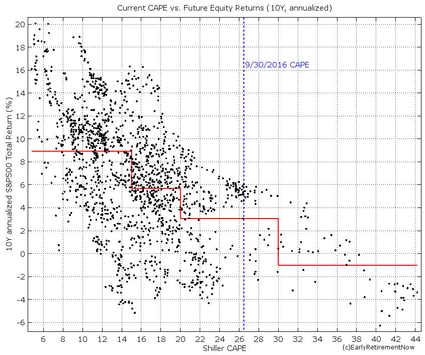
That’s right, today’s CAPE ratio is pretty good at predicting future equity returns. Well, not perfectly but there seems to be a strong and statistically significant inverse relationship between the CAPE and forward-looking equity returns, see chart below where we plot the CAPE ratio versus the subsequent 10-year annualized S&P500 return. For something as ostensibly unpredictable as stock returns, this is truly amazing. Equity returns are not exactly a random-walk! If we split the CAPE into four regions we get pretty different average equity returns by bin:
- CAPE below 15 (below the median): Average equity return of 9% real (!)
- CAPE slightly elevated (15-20): Average equity return just under 6%, still very solid returns that will likely support a 4% safe withdrawal rate.
- CAPE moderately elevated (20-30): Only about 3% real return (!) going forward. Today’s CAPE falls into this range. The 9/30/2016 level was at just under 27, and after the recent rally, it’s even a bit above 27.
- CAPE severely elevated (30+): A below -1% real return over the next ten years. Bummer! Good luck starting your retirement in that environment!
Simulation results
Let’s look at the Success rates over 30-year (top panel) and 60-year horizons (bottom panel). The charts have the familiar format you might remember from before, plotting the success rates as a function of the portfolio equity share (rest invested in 10Y Treasury Bonds). In this chart, each line corresponds to the success rate of a different CAPE regime at the beginning of retirement.

Quite intriguingly, over the 30-year horizon (top panel) and for equity weights greater than 40%, every single failure of the 4% rule occurred when the CAPE was above 15 at the start of retirement. In contrast, for all CAPE<15 you have a 100% success rate. You get close to a 100% success rate with a 75+% equity portion and the CAPE<20. I wish the original authors of the Trinity Study had dug deeper into when those failures occur.
Also, did we mention that a 30-year horizon is an entirely different animal from a 60-year horizon? Oh, yeah, we pointed that out before, but to state the obvious, success probabilities are much, much lower over the longer horizon.
Anyway, the current CAPE of 27 falls smack into the 20-30 region represented by the yellow line. At a 60-year horizon with capital depletion, we are now looking at a 72% success rate with 100% equities (much lower than the 89% success rate over 30 years). Quite amazingly, lowering your equity share in response to expensive equity valuations will actually lower (!) your success probability. How crazy is that? True, for a seriously overvalued equity market (CAPE above 30) you do get a bit of a hump-shaped curve (see the maroon line in the bottom panel) with a sweet spot between 70 and 80% equity weight (same is true for the 30-year horizon with both the 20-30 CAPE and 30+ CAPE). But for the other three lines in the bottom chart, including the yellow line representing today’s regime, we see that the success probability is solidly increasing monotonically in the equity weight. Equities rule when you’re looking at a 60-year horizon! Again: due to the long horizon, investing in equities is the way to go even if they are overvalued in the short-term. Bonds with a 2.6% long-term real return just threaten your long-term sustainability as we mentioned here. (Of course, one solution would be to have a higher bond share only until equities return to a CAPE<20 and then increase the equity share again. But we haven’t calculated that yet.)
Higher final value target
As we stated previously, a zero final asset value is not acceptable to us due to our strong desire to leave a bequest. As expected, once we target a higher than zero final asset value, the success probabilities diminish even more, as we pointed out previously. Below are the charts for targeting a 50% final asset value target.

Now even the CAPE regimes of below 15 or 15-20 no longer guarantee success over a 60-year horizon (or even a 30-year horizon for that matter). Bummer! The only good news is that the higher final asset target only lowers the success probability to 71%, from 72% (bottom chart, yellow line, 100% equities).
Let’s lower the SWR to 3.5%
Lowering the withdrawal rate to 3.5% should improve the success rates, as we pointed out last week: at 100% equity share we had a 96% success probability preserving 50% of the final value after 60 years. That rate goes down to 88% when the CAPE ratio is between 20 and 30. Of course, for CAPE values below 20, the 100% equity portfolio had a 100% success rate, both over 30 and 60-year horizons. Nice to know, but again, today’s CAPE is at 27. For me personally, a 12% failure probability is still a bit too high.

How about 3.25%?
To insulate ourselves from running out of money we likely have to lower the SWR all the way to 3.25%. Now we can get all the way to 97% success probability with 100% equities and even close to 100% with an equity share of 80-90%, see chart below.

I wouldn’t want to get my hopes too high about the benefits of bonds, though. Despite the recent rally in bond yields (and the resulting pummeling of bond prices) since November 8, yields are still extremely low by historical standards. For example at 2% annual inflation and around 2.5-2.6% yield for the 10Y Treasury Bond, we are looking at 0.5-0.6% real yield. Much less than the average 2.6% real return!
Update (2/7/2022): As suggested by reader AndyG42, I should point out that over the years, my views on the 100% equity portfolio have evolved. It’s certainly true that the probability of failure is small but if you like to eliminate the chance of a failure in past historical cohorts, you’re better off with a lower-than-100% equity weight, likely somewhere around 70-80%.
Conclusion
We face a triple-whammy of bad news when it comes to safe withdrawal rates and using the Trinity Study data for our purposes:
- We have a longer retirement horizon. My wife will be in her mid-30s when we retire and her family seems to have a longevity gene. We like the money to last until my wife is at least in her mid-90s. We face a 60-year retirement horizon, twice the longest horizon the Trinity Study considers.
- We like to leave a bequest
- Today’s equity expected returns could be low due to the current sky-high equity valuations
All of that does not bode well for the 4% rule. To push failure rates of the withdrawal strategy to a low enough level, we’d likely have to lower the SWR to 3.25%.
Quite intriguingly, bonds don’t offer much benefit for the success rates, unless stocks are wildly overvalued, with much higher CAPE ratios than today’s value (>30!). For CAPE ratios below 30, mixing in bonds has either only a marginal benefit or even lowers the success probability.
What we learned so far: The Trinity Study and many in the FIRE crowd seem to recommend a generous withdrawal rate and conservative stock vs. bond allocation. But with a 4% SWR and 70-80% equity weight you have a roughly 1 in 3 chance of wiping out your money after 60 years. We want to do the opposite: A conservative withdrawal rate (e.g. 3.25%) and a generous equity weight (e.g. 100%). Who would have thought!?
How much weight should we give the cape ratio in modern scr planning when for most of the the sp500’s history it was at 20 or below? It seems that all of the scr figures are based on the cape ratio. Could it be that there’s more wealth and more participation/buyers in the market now and that the price each buyer is willing to pay for each dollar of earnings will continue to rise because of this. Just spitballing some thoughts here BigErn. Looking forward to your perspective regarding the historical divide btwn a 20 cape.
I’ve developed a new adjusted CAPE, see here: https://earlyretirementnow.com/2022/10/05/building-a-better-cape-ratio/
It makes the CAPE a bit more comparable across time. But today’s values are still wayyyy above historical norms.
The wrong conclusion would be “valuations don’t matter anymore” (Irving Fisher tried that). The right conclusion would be to assume that returns might be a little bit lower than historical averages. Which is not the end of the world.
According to the charts above, there’s an error in the following:
“Quite intriguingly, over the 30-year horizon (top panel) and for equity weights greater than 40%, every single failure of the 4% rule occurred when the CAPE was above 20 at the start of the retirement. In contrast, for all CAPE 40%, there is still some failure with the blue line (15 <= CAPE < 20), which is CAPE below 20.
Corrections:
"4% rule occurred when the CAPE was above [15] at the start…"
"for all CAPE<[15] you have a 100% success…"
Yeah, sometimes the comments get cut off when using the “<" or ">” symbols because html thinks that’s html code. I will reply to the corrected version!
My comment wasn’t posted correctly. What I wrote was:
According to the charts above, there’s an error in the following:
“Quite intriguingly, over the 30-year horizon (top panel) and for equity weights greater than 40%, every single failure of the 4% rule occurred when the CAPE was above 20 at the start of the retirement. In contrast, for all CAPE<20 you have a 100% success rate."
There is still some failure with the blue line (15 <= CAPE < 20), which is CAPE below 20.
Corrections:
"4% rule occurred when the CAPE was above [15] at the start…"
"for all CAPE<[15] you have a 100% success…"
Correct. Failures of the 4% rule occur when equities are expensive. In contrast, when we’re at the bottom of a bear market, you’d be crazy to use only 4%.
Also check out Part 54, where I noted that late in 2022, the 4% would have easily worked again. Probably more like 4.5% or even more.
I believe you misunderstood my comment. What I intended to communicate was:
You state that ‘for equity weights greater than 40%, every single failure of the 4% rule occurred
when the CAPE was above 20 at the start of the retirement’. This is not true.
At 40% equities we see failures with the yellow line which had CAPE between 20 and 30, however there are also failures in the blue line which had CAPE between 15 and 20. Since the blue line includes retirements with CAPE between 15 and 20 and it had failures your statement above is not true. There are failures when the CAPE is above 15, not 20 as stated in the article.
Additionally your article says ‘In contrast, for all CAPE<20 you have a 100% success rate'
This also, is not true. At 40% equities the blue line has retirements starting with CAPE between 15 and 20, meaning there are some retirements with CAPE under 20, however we can see in the graph that the blue line has roughly a 92% success rate at 40% equities, not the 100% stated above.
OK, gotcha. That was an incorrect statement. Let me work on rephrasing that.