February is “Macroeconomics Month” on the ERN blog! And the topic of inflation fits right in. My blogging buddy Actuary on FIRE suggested doing a series on the “Inflation Risk for Early Retirees” and I like that idea because this topic hasn’t gotten all that much attention in the FIRE community. Even though inflation is a top concern for 78% of retirees, according to this recent article.
In addition, the topic is not just extensive enough to span multiple blog posts, but it also greatly benefits from the viewpoints of two experts in their respective fields: An actuary and an Econ Ph.D. each with their own expertise in number crunching. AoF started the series last week with the introductory post, Part 1, and this week it’s my turn. Just like AoF, I like to start setting the stage and give a little bit of an overview – think of this as another introduction to the inflation topic, just by a different kind of numbers geek. So, today I’ll take a brief look at the U.S. inflation history and the different ways inflation can ruin our retirement. Let’s jump right into this…
147 years of inflation: A Brief History
Let’s look at a very long time series of the U.S. CPI (Consumer Price Index). In the chart below is the CPI normalized $1 in 1871. So, one can think of this as the price of a $1 basket of goods over time, though the basket obviously changes over time; fewer horse buggies and more consumer electronics in 2018! And just to be sure, the actual CPI series as constructed by the U.S. Bureau of Labor Statistics starts only in 1947, but some smart economists have backfilled the data all the way back to 1871, see data from Robert Shiller (in the same file as the CAPE estimates). It looks like inflation wasn’t much of a problem during the first half of the sample. Between 1871 and the early 1940s the CPI moved sideways, with a few small wiggles. Then came a gradual increase until about 1973, followed by a rapid CPI rise during the two oil shocks and a steady increase ever since.

Why is that chart slightly misleading? Well, let me display the exact same data but in a very different format. Instead of the cumulative nominal cost of that representative basket of goods, let’s look at the year-over-year inflation rates. And throw in the 5Y and 10Y average annualized inflation rates as well. Suddenly, the last 30 years don’t seem quite so scary anymore:

Sure, inflation chipped away a modest percentage every year since the 1980s, about 2% on average, but the fluctuations were pretty modest. I take that over the crazy CPI fluctuations in 1870-1950: between -20% and +24% year-over-year – good luck holding nominal bonds during that time! And the runaway inflation during the 1970s wasn’t much fun either. So to everyone complaining and worrying about inflation today, I can offer some consolation: I take our current inflation environment over those in the past!
But I don’t want to belittle inflation. We are still left with losing about half of our purchasing power over a typical 30-year window. And it looks even worse if that window includes the 1973-82 period. Over 50 years, we’ve lost more than 80% purchasing power!

Why the wide swings in the chart above? Compounding! To demonstrate this, let’s look at how $1,000 is slowly inflated away over different time horizons and for different inflation rates, see table below. Over 60 years, going from 2% to 2.5% inflation means going from $304.78 to $227.28 real purchasing power. Small differences in inflation compound to large effects over the decades! It’s one of the reasons why I’m not a big fan of (nominal) annuities; they may give me some cash flow certainty in the short-term but I can’t forecast inflation decades ahead and find the risk to long-term purchasing power too large!

Summary so far:
Inflation can ruin our retirement in (at least) two ways:
Inflation risk #1: If we ignore inflation altogether we’ll be surprised by how much inflation will likely chip away from nominal values, e.g., pensions and annuities that lack cost-of-living-adjustment (COLA).
Inflation risk #2: Inflation uncertainty. Even if I do make allowances for some trend inflation rate over the horizon of our retirement, small variations in the actual realized inflation rate can cause huge changes in my future purchasing power.
But not all is lost. Here’s how I sleep soundly at night despite inflation:
How I personally stopped worrying about inflation: Simply use inflation-adjusted returns!
Obviously, this is a little bit tongue-in-cheek, but there is still some truth to it! Our money won’t sit around in a checking account with zero interest to be slowly eaten away by inflation. We put the money to use in high-return investments that hopefully beat inflation over the long-haul! Let’s look at the chart below. It plots the CPI index since 1871 again and both the nominal and real S&P500 (total return, i.e., with dividends reinvested). All normalized to $1.00 in 1871.

Clearly, this asks for a log-scale on the y-axis because since 1871 a single dollar invested in the stock market would have grown to a staggering $285,000 by the end of 2017! It sounds like a lot, but this is still “only” 8.9% annualized compounded return! But even after inflation wipes out roughly 95% of the value of the dollar, that single dollar investment would have still grown to more than $14,000, about 6.7% annualized. And that came as a nice and steady growth path along a straight line on the log-scale (i.e., exponential growth in real dollars). In other words,
Equities are an excellent inflation hedge over very long horizons!
And they should be because corporations will face price increases both on the cost and revenue side, so over the very long-term, corporate profits will definitely catch up with inflation.
But as one semi-famous economist once said, “In the long-term, we’re all dead!” I’m the first to admit that inflation can do and has done damage to equity portfolios in the past (and I’m not looking at bond portfolios yet!!!). Most recently, in the 1970s and early 80s: Inflation was high and coincided with poor real equity returns. And sure enough, the 1970s were one of the examples where the equity and bond portfolio drawdowns were bad enough to wreak havoc on retirement portfolios. That flat-to-slightly-down path of the (real) equity portfolio created some serious Sequence of Return Risk! So, in one of the future posts of this series, I’ll certainly write some more about how I think about hedging against inflation risk over shorter horizons. Stay tuned!
How I account for inflation in my Safe Withdrawal Rate Series
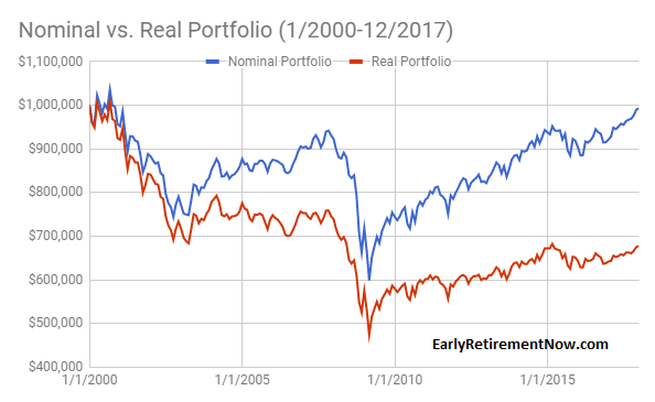
One other issue I wanted to address is how I run my simulations in the Safe Withdrawal Rate Series, especially how I would account for inflation. This issue also came up after I did the ChooseFI podcast last year. I replied to that and Jonathan and Brad read that reply in the Episode 35 Roundup, but here I can elaborate some more. Let’s look at the simple example below I display the (nominal) portfolio returns and year-over-year inflation rates. Of course, I always do my simulations at a monthly frequency but for this simple exercise with “made up” data, I’ll use annual data. In the column on the right, I calculate the real year-over returns, not by subtracting CPI inflation from the nominal return, but through compounding. I include the formulas in the table for the numbers geeks.

And now there are two ways to calculate our withdrawal calculation
Method 1: With nominal numbers. I inflation-adjust the withdrawals and then iterate forward the nominal portfolio values by via
P(t)=[P(t-1)-W(t)] * (1+r(t))
See table below. Notice something? The nominal and real portfolio values start deviating substantially over time! While the nominal value reaches the $1m mark again, the real portfolio is still lagging behind!

So, in other words, here is another way inflation can mess with our early retirement:
Inflation risk #3: Adjusting the withdrawals for inflation but forgetting to do the same for the portfolio value! It would be too tempting to claim success for the 4% Rule in the numerical example above. The portfolio recovered back to the initial $1m value but only in nominal terms! Now the 4% has become a 5% rule! Specifically, we’re withdrawing $50,781 out of a $1,001,852 portfolio (in nominal terms) or – equivalently – we’re withdrawing $40,000 real dollars out of a $769,900 portfolio!
Method 2: With Real, Inflation-Adjusted Numbers. The way I normally run my SWR simulations is to express all values in real, inflation-adjusted terms and then use the same formula again P(t)=[P(t-1)-W(t)] * (1+r(t)):
- Real withdrawal amounts, $40,000 fixed in this example, but I can vary that, too, and allow increasing or decreasing real consumptions amounts or factor in future supplemental payments. See my Google Sheet toolbox (SWR Series Part 7) for calculating safe withdrawal rates.
- Real inflation-adjusted returns, i.e., from the right column in the first table: rr(t) = RR(t)/RR(t-1)-1.
- Real portfolio values.
And the simulation is in the table below. Everything is ready to use in real dollars and comparable across time. And there is no way I could bungle the real vs. nominal portfolio values. Also, notice that the real portfolio values are exactly identical to the ones in the more cumbersome calculation that goes through nominal values first:

How common is it to confound nominal and real portfolio values? Well, one prominent example is Michael Kitces’ post on how the 4% Rule held up since the Tech Bubble. Kitces makes the very valid point that a retiree starting with a 4% withdrawal rate in 2000 – at the peak of the Tech Bubble – would have recovered almost all the losses from the two big bear markets by now. But that’s in nominal dollars (!!!) and he makes sure to mention this in his blog post:
“Of course, an important caveat to the chart above is that it’s based on ‘nominal’ dollars, not adjusted for inflation. Which is important, because it means that retirees who had similar portfolio balances after the first half of retirement were not necessarily going to have the same buying power with those dollars for the rest of retirement (because of what inflation had been in the first half of retirement).” From: Kitces.com
But nevertheless, people in the FIRE community still frequently read past that paragraph and claim that this demonstrates the sustainability of the 4% Rule. But it doesn’t! At least not for early retirees. And inflation is to blame! I recently ran the numbers again (to update the numbers from the blog post in Part 6 of the SWR series), simulating a 60/40 portfolio, $1,000,000 initial portfolio value and $40,000 annual withdrawals (adjusted for inflation post-2000) and indeed the nominal value is now $992,000. Within striking distance of the initial $1m portfolio value! But in real terms, we’re still at only about $677,000! In other words, one would now withdraw almost 6% of the current portfolio value (40/677=5.9%), which may be OK for a 65-year old starting out with a 30-year horizon in 2000 and who has to fund retirement only until the year 2030 or so. But not so much for early retirees who still would have to make the portfolio last until the year 2050 or 2060!
Conclusion
So much for today! This was just a brief history of U.S. CPI inflation and a few of my thoughts on how inflation can mess with retirement, especially over the long horizon we face in early retirement. Stay tuned for more parts in the coming weeks. We’d also like to hear your suggestions for other inflation-related topics!
“Our money won’t sit around in a checking account with zero interest to be slowly eaten away by inflation.” Sadly for many people, to the extent they have savings, this is exactly what happens to their money. Which is why it is so important to invest, to try and stay ahead of inflation.
Yup, lots of investments have rates of returns too close or even below the inflation rate (short-term CDs, money market, etc.)! It’s hard to grow a big nest egg with that!
Thanks for stopping by!!!
The semi-famous “economist” who coined the saying “in the long run we’re all dead”, used it as a justification exactly for his inflationary doctrines.
Haha, I didn’t even know that! Thanks for bringing that up! Cheers!
Inflation can potentially be the silent killer of many retirement portfolios.
Silent Killer, that’s an appropriate description! 2% a year? That’s nothing in one year but it piles up over the decades!
Thanks for stopping by! 🙂
Where do you fall in the debate on the view that CPI overstates inflation compared to other measures (like PCE)?
https://www.stlouisfed.org/publications/regional-economist/july-2013/cpi-vs-pce-inflation–choosing-a-standard-measure
On a year to year basis, the difference in immaterial; over a 30-60 year retirement, it can be the difference between failure and comfort.
Hi Trent,
I hold the view that (because it is a geometric rather than an arithmetic measure) CPI UNDERSTATES inflation. A (simplistic) example:
(i) people spend equally [1 unit of currency on each] on food and on fuel – i.e. total spend is 1+1=2 units of currency,
(ii) they spend on nothing else
(iii) due to farming efficiencies the cost of food subsequently halves but due to rising demand the cost of fuel subsequently doubles – i.e. the revised total spend is 0.5+2=2.5 units of currency (a rise of 0.5).
(iv) clearly, inflation is perceived to be the rise divided by the original – thus 0.5/2=.25 (i.e. 25%). RPI would be 25%.
(v) CPI rate of inflation is 0% (because the geometric average of 0.5 and 2 is 1).
Cheers, Tim
Yes geometric means will always be lower, but this assumes that the arithmetic mean is “correct.” I see no reason to assume this. Anyway, problems with inflation measures extend beyond these statistical concepts, and many economists make strong arguments that the idea itself is imperfect. Baskets of goods change in identity and quality over time, and this makes comparisons difficult or impossible. It confuses two concepts: change in prices for monetary factors (money supply) that should affect all goods similarly, and changes in prices for other economic reasons (supply and demand). To use your example, if the price of fuel rose because fuel became more dear, this is not the same thing as the price of everything doubled because the government printed twice the amount of money. I care about both, but I care about them differently.
To use an example useful to this discussion, think of healthcare prices, which are increasing faster than most other things, and will affect elderly people disproportionately. Imagine you have disease X and you are currently getting treatment Y for price Z, but Y is not very good. Now, a new treatment A comes out at a much higher price B, but A is awesome, like a cure. Did you experience inflation? If “treatment for disease X” is part of the measured basket of goods, you would have; but you didn’t just see a rise in price level, you were made materially better off. I’m not sure that is what we want to measure with the idea of inflation. And so it is with all the goods in our basket.
This is all a long way of saying that the very concept is fraught, and I am not totally sure our measures and the way we talk about it are helping to clarify. I’m not a nihilist – we have to measure SOMETHING, because clearly over time all prices have risen, and we know that our monetary policy aims to slowly increase the money supply. But, knowing these conceptual problems with measurement, I think our intuition should tell us that we probably are overstating things somewhat.
This is not how the CPI is calculated. The CPI is not the geometric average over the buckets. In your example, the CPI rises from 2 to 2.5, for an annualized increase of 25%.
The difference between PCE and CPI is that in your example people will consume less energy and more food because of a change in the relative price. Because the good that has the lower inflation gets a higher weight over time it will generate a lower PCE inflation than under the fixed basket weights used by the CPI.
Many apologies ERN and Trent, I am UK based … and here in the UK CPI produces a lower inflation rate than the alternative RPI for several reasons but predominantly because CPI is (at least partly) geometric. See s2.1 of http://obr.uk/docs/dlm_uploads/Working-paper-No2-The-long-run-difference-between-RPI-and-CPI-inflation.pdf
Looks like we’ll have to agree to disagree to an extent on the “substitution” point – if energy costs double, I still have to heat my house!
Thanks for the clarification, re the UK RPI!
Unless you have a zero price elasticity of energy demand, there will be a substitution effect. There may be some goods with low elasticity (gasoline is that, at least in the short-run), but even there we will see a (small) substitution effects and thus PCE inflation < CPI inflation. 🙂
Excellent question!
As a very careful comparison shopper, the PCE should be more appropriate for my purposes. That’s the one where demand changes are factored in, rather than taking one fixed basket.
So, I hope that the PCE will give me a boost of 0.2-0.3% in the SWR!
The PCE is also more representative in terms of housing costs (which are rallying now and the CPI has a much higher weight). I think it’s about 15% weight for housing cost in the PCE and 32% in the CPI because the CPI-U is for urban consumers!
“For inflation acts as a gigantic corporate tapeworm. That tapeworm preemptively consumes its requisite daily diet of investment dollars regardless of the health of the host organism.” – The Oracle of Omaha himself.
Whether you are a business (large or small) or an individual investor basking in the glow of early retirement, inflation cares not one bit as it silently munches away at even the healthiest portfolios.
Your withdrawal simulation tables are striking and keeping us all real…..
Thanks, Dr. PIE! Very classic quote from the Oracle! Thanks for sharing! Let’s all stay ahead of inflation!!!
Thank you for highlighting inflation as a topic. I’m showing my age here, but my first investment was a CD at 16.25% that I purchased around 1981. I even locked it down for 2.5 years. It sounds like a good investment, but I don’t think it was!
Oh, my! I’m not much younger because I still remember the high single-digit returns only a few years after that! Thanks for sharing!!!
I’m starting to think that inflation is actually not quite the right measure for early retirees who have extremely long retirements.
Wages go up faster than inflation. Real wage growth is basically the defining feature of economic progress. And that means household spending goes up faster than inflation. In 1900 the average household spent $769 a year. If you just inflation-adjust that to 1950-dollars you get $2,061. Except the average family in 1950 actually spent $3,808. Just using inflation adjustments alone understated things by nearly 50%.
It might be tempting to scoff at it as “lifestyle inflation” but what it means in practice is that if you start out a 50-year retirement with middle-class spending levels and simply adjust for inflation, then 50 years later you’ll end up with lower-class spending levels.
In practice it might mean something like a 1900 retiree never getting a radio or TV or a washing machine in their house; a 1950 retiree never gets internet or a mobile phone or does international travel. And who knows exactly what it means a 2020 retiree is doing without in 2060?
I think that most people implicitly want to remain in approximately the same socio-economic class — and thanks to economic progress — the bands for your socioeconomic class are growing faster than inflation. Finding one’s self shifting down a few deciles may not be quite what is envisioned for one’s early retirement.
That said, my theory above is hardly an open-and-shut case. I see it more as something to explore more. Does owning a home counterbalance some of the above? We appear to be in an age of diminished real wage growth (only 10% since the 1970s, IIRC) so perhaps the effect going forward is now so small it can be effectively ignored?
>2060
>can’t even afford a maid robot
Why even retire now if you want to live like a poor person in 2060?
Great point! Maybe your real spending should not stay constant but grow at least at the per-capita GDP growth rate. That would make the 4% rule even less sustainable!!!
Hi ERN, great post. Have you seen the numbers (and all the rationale behind them) at shadowstats.com? Putting 10% instead of 2-ish% into any modeling spreadsheet for early retirement will make a, ahem, substantial difference in outcomes.
Well, that guy seems to live in some alternative universe. I don’t think that inflation is 4 percentage points higher than reported. And the shadowstats GDP numbers are even more out of whack.
Big ERN, I appreciate how you’ve chipped away at the sacred 4% “rule” again by coming at it from a slightly different angle. Instead it really is a “rule of thumb” and as you’ve shown takes a little more powerful analysis to reduce risk in building a portfolio that can weather macroeconomic realities. Looking forward to your additional thoughts on hedging against inflation risk. And at the “risk” of both using a bad pun and asking a stupid question, are there any investment vehicles or classes that can directly take advantage of inflation instead of being purely weighed down by it?
Thanks for the compliment!!!
Regarding your question, yes, definitely, I will write some more on the inflation-hedging abilities of different asset classes! Stay tuned!!!
Outstanding post! And thank you for your tremendous work on the SWR series – it is an outstanding resource. This post also makes me wonder about holding on to our mortgage (currently at 2.875%). We could either use cash to pay off the mortgage, or consider the mortgage a monthly expense and invest a portion of the cash we would have used in equities. In high inflation/high risk periods, it may make sense to hold the mortgage.
Thanks! Once you locked in at that rate it may be a good idea. You are effectively shorting bonds and bonds have gotten hammered.
Great series of posts. I am following them.
Awesome! Glad you liked this series! 🙂
I’m curious about the chart showing how much stocks are a hedge against inflation. As noted the S&P returns (bothe no inal and real) are “total return, i.e., with dividends reinvested). All normalized to $1.00 in 1871.”. For a retiree withdrawing from a portfolio, those dividends are likely NOT reinvested, but instead support yearly spending. How does that loss of divivend reinvestment change the amount of return/hedge?
From Part 12 of the SWR series, here’s a chart of the real S&P500 with dividends taken out. But careful! The dividend yield used to be much higher in the past: 6%. Today it’s less than 2%. So this chart is not representative of how a withdrawal strategy would look like. Probably 2%-points of the dividend yield would have been reinvested early on, but later you’d have to withdraw another 2%-points from the capital gains to supplement the paltry 2% dividend yield!
https://earlyretirementnowdotcom.files.wordpress.com/2017/03/swr-part12-chart52.png
Great graphs!
The inflation factor proves why one needs to keep invested, even in retirement. Don’t even think to keep it under the mattress. As for bonds, maybe some. But you need to keep invested so they will rise with inflation.
Completely agree! Equities are the way to go! But equities can suffer from inflation shocks, at least in the short and medium-term. See upcoming Part 4! 🙂
The phrase “measure it with a micrometer, mark it with chalk and cut it with a torch” comes to mind. First off let me say I firmly believe that inflation is corrosive to future ability to spend. An insulin price increase over the past years is real. But published inflation numbers are somewhat a distortion.
First off, here is a link with a high level discussion of the CPI basket of goods: https://www.investopedia.com/terms/b/basket_of_goods.asp
Here is why I think the CPI is a bit flakey for FI planning … I bought my first new car in 1975 for $5,500. It was a gas hog, wasn’t all that safe and at 35,000 miles it was rusting. I recently bought a MUCH nicer 2013 hybrid SUV for about $35,000 (about $65,000 sticker in 2013) with about 45,000 miles and it is like new and it should last MUCH longer than that 1975 car.
The point being that there is no way to calculate inflation here since the product changed so much even though they are both automobiles (A Mustang, Corvette, Challenger today is nothing like their predecessors in cost, life, performance or features). A refrigerator today is no comparison form a 60’s refrigerator. A gallon of gasoline today is so different from 50 years ago. One could even say that the proverbial “loaf of bread” has changed.
Medical expenses are often quoted as higher than average inflation. But some treatments today may give you many more years of good quality life vs. the treatment 15 years ago. How do you calculate CPI here? It is simply not by comparing bills of then vs. now.
A friend is replacing a 20 year old ground source heat pump with a current model. Yes there is a price increase but the new model is 25% more efficient amongst other improvements. In the end, the “complete analysis” inflation adjusted cost of the new unit may actually be negative, not positive. But the traditional computation does not factor product changes (airbags in cars) or reduced operating costs (MPG improvements) and so on.
If an item has a “CPI” of 3.48274% per year … but costs 25% less to operate and lasts 50% longer with 30% lower maintenance costs … is a “CPI” of 3.48274% per year really a good number for it when factored into future spending?
So measuring CPI figures with a micrometer my be interesting/fun but remember it really is just a chalk mark relative to impact on future spending. If one wants to eliminate the “mark it with chalk and cut it with a torch” affect, the question is … what proxy can one use that reflects their own personal inflation future? IS CPI a good proxy for you? Or is it one we (mis)believe correlates with our future experience? That will keep your HAL9000’s mind off the pod bay door for a while.
Two phrases come to my mind:
“it takes a model to beat a model” If you don’t like the way CPI is constructed, that’s your right. Unless and until you provide an alternative (with monthly time series going back to 1871, please) I’ll keep using the CPI because it’s the best measure I have. But I am aware of the limitations. I studied a lot of economics. And I taught economics, too. At all levels; undergraduate & Ph.D.
“let’s not miss the forest for the trees” The CPI is for a basket of goods and services. Some goods and services will have higher, some have lower inflation. You can come up with all sorts of examples of goods/services with a very different experience from the overall index. Some with lower, some with higher inflation. That’s exactly why we construct a basket and a CPI.
A few other comments!
1: Contrary to your belief, quality changes are actually factored into the CPI:
https://www.bls.gov/cpi/quality-adjustment/questions-and-answers.htm
2: The basket is periodically updated to reflect the changes in consumer preferences. You can also use a chain-weighted index like the PCE index. Here, the change in the basket is done continuously & instantaneously because you measure (more or less) exactly what’s consumed economy-wide that month.
Thanks for the info and link. It helps. CPI is currently amongst the best to use, I use it, but I still view published CPI numbers more as “chalk” than a scribed line. When I input inflation estimates into my model, I do so understanding that my reality may (will) vary from published and although it may not make a significant difference in the next near years the compounding error may be significant many years out.
I can see the value of a new model that better correlates to FI folks versus the population as a whole. Individual customization for age and spending profile would be desirable. I’m sure “Captain Ron” has much different inflation concerns vs. “Mr Corporate” vs me.
Until a better model, here are two “methods” to use with the current model:
– Periodic analysis (annual?) and updates … which captures more items than CPI such as actual current savings and current spending in general.
– Stress testing the results. Run the tool with CPI, CPI +x%, CPI +y%, CPI-z%. Then look at the results and if still acceptable you will feel better about the forecast’s risks.
Using elderly focused CPI-E for older folks may be better than using CPI-U
Very true! That’s a good one!
Agree. Good point. I would certainly recommend the CPI+/-x in case you think that your personal CPI rate is above or below the official one. My suspicion is that for older retirees, it will be mostly CPI+x. 🙂 Thanks to medical inflation.
Great post! However, although nominal and real portfolio end of year interim values differ greatly under your two scenarios, both Method 1 and Method 2 produce identical SWR over the same fixed time period (assuming $0 ending portfolio values).
The SWR calculation should the same for Method 1+2 because the real portfolio value is the same. And for $0 final value you have the added benefit of nominal=real.
Hi Karsten,
first of all thanks a lot for this great blog and also for making your SWR Toolkit public!! For my own FI-journey I have also developed a toolkit but I handle inflation by always converting withdrawals and portfolio values into nominal values (using the corresponding CPI data when I calculate historic returns) before I calculate SWRs from them. Doing this, I noticed that the lowest SWRs usually result from the retirement cohorts in the late 60s and early 70s instead of the great depression in 1929 due to the bad combination of high inflation and recessions that followed.
Fortunately my own personal finance situation in Germany include sizable contributions from public pensions (roughly inflation adjusted) and corporate pensions (with lower fixed adjustments). Now when I try to model this situation using the Cash Flow Assist tab in the SWR toolkit I get significantly higher SWRs compared to my own toolkit. I have looked into your calculations in the SWR toolkit to better understand why that might be the case and saw that you convert the supplementary cashflows using a fixed inflation rate into real cash flows. From my perspective this could lead to artificially higher real supplementary cashflows especially during these historically challenging periods with high inflation. Wouldn’t it be better to also translate them into real cash-flows using the actual CPI inflation data? But probably I am still missing a piece of the puzzle…
Thanks.
Agree. Nov 1965 is often the worst-case scneario.
Your results and my results should be identical. I went through an example in this post, detailing how my approach using real returns is the exact same as using nominal returns and CPI-adjusting your withdrawals.
This arithmetic should not change in the presence of supplemental cash flows. My Social Security is inflation adjusted. My home value will (hopefully) rise in line with inflation. Basically all my future flows are in unknown nominal values because I don’t know what inflation will be.
What would obviously be incorrect is – and this might be what you’re doing – is to assume your future pensions go up by only 2% nominal every year, but then deflate it all away with 1970s-style inflation. That would generate lower SWRs, but it would also be highly improper.
Hi Karsten,
thanks for your quick reply! I understand your calculations that all cash-flows are treated as inflation-adjusted “real” cash flows. Hence portfolio value, withdrawals and also supplemental cash-flows that are inflation adjusted like social security are treated in a consistent manner. The only problem is see is with columns G-K in your Cash Flow Assist Tab. There you use a fixed inflation rate (2% as per your default) when you transform them into “real” cash-flows. My point is that the resulting real cash-flows are too optimistic compared to the actual inflation effect that happens for retirement cohorts that suffer from larger and longer inflation periods. In case these contributions are bigger (which they are in my case due to company pensions) this can lead to a significant effect on the minimal SWR. In my specific case your sheet gives me a minimal SWR of around 17.5% whereas I get a value of just around 15% when I take the full inflation effect into account also for these cash-flows in my toolkit.
Regarding your last paragraph: Actually that is exactly what will happen. My company pension will only go up by 1% each year (the legal minimum here in Germany) and in an 1970s style scenario will therefore quickly loose relative value compared to my public pension which will (hopefully) continue to be inflation adjusted. This seems to be the main reason for the reduced minimal SWR because this scenario has a larger effect.
In my toolkit all cash-flows time-series are iteratively developed with the real returns and also transformed into nominal values using the corresponding CPI inflation data. This is much more computationally intensive compared to your approach but allows me to use the same inflation sequence for all inflation-dependent cash-flows. My main reason to look deeper into your sheet was to use it as a (already battle-hardened) cross-check to verify my own SWR results. Fortunately my SWRs are lower compared to yours, so in case there is still a bug in my code this at least steares me to the more conservative side. 😉
I will try to play with fixed inflation rates in my toolkit as well in the next days to try to replicate your results. Thanks again for providing your toolkit and also for getting back so quickly.
Best
– Uwe
Hi Karsten,
I am now able to exactly replicate your SWR results using fixed inflation rates to take into account non-inflation-adjusted additional cash-flows. Let’s take the following simplified example using your sheet:
– 100% US S&P 500 stocks only in the portfolio
– 600 months retirement horizon
– Expense-Ratio (p.a.) set to zero
– Final Target Value set to 0%
– Initial Portfolio Value of $500,000.00 (in Cash Flow Assist)
– Inflation rate of 2.0% p.a. in Cash Flow Assist
– Remove all existing cash-flows in CashFlow Assist and only add a constant $2000 non-inflation adjusted pension in column G over the whole 600 months.
The minimal SWR in your sheet using these parameters is then 6.48% for the 1929-08 retirement cohort and i get the exact same result from my tool.
However if you calculate the actual inflation-effect on the $2000 pension instead of using the artificial 2.0% you will see that the minimal SWR then goes down to only 5.83% for the 1968-11 retirement cohort. So quite a substantial effect in case there are non-inflation-adjusted additional cash-flows that are significant compared to the “normal” withdrawals.
BTW: I have seen that you subtract 1/12 of the Expense-Ratio p.a. from the monthly return in column W of Stocks/Bond Returns. Shouldn’t this be rather (1+er)**(1/12)-1? It’s an almost negligible effect when it is set to the default 0.05% p.a. but took me some headscratching to understand why the numbers came out only so slightly different … 😉
Best
– Uwe
Yes, applying the much higher 1970s/80s inflation rates will eat up much more of that nominal payment. Makes sense.
I treat the expense ratio the way it is normally treated in the industry. If the expense ratio os x%, then the monthly drag is x%/12. The effect between linear and compounding is trivial in the range of expense ratios normally used in the industry.
This has nothing to do with calculating withdrawal rates in real or nominal terms. The problem is that there is a very real „sequence-of-inflation risk“ which affects non-inflation-adjusted supplemental cash flows and your sheet in its current form does not account for this. This can lead to significantly lower safe withdrawal rates (in real$) for these scenarios.
I have tried to model this using the case-study tab in your SWR Toolbox. I have added a new column J which contains your CPI values and column K to contain the supplementation cashflow scaled down using these real inflation rates. In column E I then calculate the portfolio value using the real inflation adjusted cashflows. So we can easily compare columns D and E to see the effect.
If you use the Retirement Start of 1929-09 and enter your minimal SWR value of 6.478% in B17 the portfolio value in column D (blue line) goes down to zero after 600 months which is of, course, no surprise because that is exactly how you calculate your minimum SWR. However, if you look at the portfolio value in column E calculated with the real inflation data (red line) for this retirement cohort, they actually end up with a final portfolio value of 1.6m$ in real inflation adjusted dollars. Nice surprise for them.
Now comes the problem: Enter the Retirement Start of 1968-12. Your final portfolio value (blue line) is 1.5m$ so no problem for this retirement cohort? Unfortunately the real inflation eats away their non inflation adjusted pension payments like hell and the sequence-of-inflation risk hits them hard. They actually run out of money after month 316 (red line)! Bottom line: Your sheet does not calculate the actual minimal SWR for these kind of scenarios.
If you enter the actual minimal SWR of 5.83% you will see that the red line barely mades in to the end. So in this scenario you overestimate the SWR by about 10%. Since we are currently in a high inflation phase, I fear that this risk might be very real for people that currently plan to retire and that is why I wanted to get to the bottom of this.
I have shared the sheet under the following link and would be really interested in your thoughts on that:
https://docs.google.com/spreadsheets/d/1Q8kbMsQO1qw3qJzeQNzXivkBDPRwAJR-u4FhGPA-qDI/edit?usp=sharing
Best
– Uwe
Thanks for doing this analysis.
Yes, no objection here. But I don’t think we’ll have the 1930s deflation or the double-digit inflation of the 1970/80s again. I find the analysis looks cleaner if we simply calibrate the inflation rate.
Maybe set it to 2.5% or even 3-4% instead of the 2% default level. If that makes a huge difference in the analysis, maybe tread more cautiously.
Thanks for your reply. Using the same argument you could further cleanup the analysis by using an average real return value instead of the historic real returns again … 😉
This has nothing to do with calculating withdrawal rates in real or nominal terms. The problem is that there is a very real „sequence-of-inflation risk“ which affects non-inflation-adjusted supplemental cash flows and your sheet in its current form does not account for this. This can lead to significantly lower safe withdrawal rates (in real$) for these scenarios.
I have tried to model this using the case-study tab in your SWR Toolbox. I have added a new column J which contains your CPI values and column K to contain the supplementation cashflow scaled down using these real inflation rates. In column E I then calculate the portfolio value using the real inflation adjusted cashflows. So we can easily compare columns D and E to see the effect.
If you use the Retirement Start of 1929-09 and enter your minimal SWR value of 6.478% in B17 the portfolio value in column D (blue line) goes down to zero after 600 months which is of, course, no surprise because that is exactly how you calculate your minimum SWR. However, if you look at the portfolio value in column E calculated with the real inflation data (red line) for this retirement cohort they actually end up with a final portfolio value of 1.6m$ in real inflation adjusted dollars. Nice surprise for them.
Now comes the problem: Enter the Retirement Start of 1968-12. Your final portfolio value (blue line) is 1.5m$ so no problem for this retirement cohort? Unfortunately the real inflations eats away their non inflation adjusted pension payments like hell and the sequence-of-inflation risk hits them hard. They actually run out of money after month 316 (red line)! Bottom line: Your sheet does not calculate the actual minimal SWR for these kind of scenarios.
If you enter the actual minimal SWR of 5.83% you will see that the red line barely mades in to the end. So in this scenario you overestimate the SWR by about 10%. Since we are currently in a high inflation phase, I fear that this risk might be very real for people that currently plan to retire and that is why I wanted to get to the bottom of this.
I have shared the sheet under the following link and would be really interested in your thoughts on that:
https://docs.google.com/spreadsheets/d/1Q8kbMsQO1qw3qJzeQNzXivkBDPRwAJR-u4FhGPA-qDI/edit?usp=sharing
Best
– Uwe