
I hope everybody checked out the ChooseFI Roundup episode in early January, where I talked with Jonathan and Brad about the recent stock market volatility. They invited me for a short appearance on their Friday show after reading my piece from two weeks ago. That post was on how the recent stock market volatility will probably not obliterate the FIRE community. One issue that came up is the potential for people on their FIRE path to actually benefit (!) from the drop in the stock market. How can one possibly benefit from a drop in the stock market? It’s certainly not a guarantee. It depends on the personal circumstances and on the nature of the stock market drop! Generally speaking:
- How permanent or how transitory is the drop in the market? If your portfolio dropped because one of the equity or bond holdings went bankrupt (or you were a victim of the OptionSellers meltdown) then that’s not something to cheer about. It’s about as permanent as it gets. Not good for the investor! But frequently, the market drops without much of a change in fundamentals. Be it a “flash crash” that reverses within a few hours or even minutes or the (likely) overreaction of the stock market drop in December, one could argue that since nothing (or not much) changed in the fundamentals (GDP growth, earnings growth, etc.) the drop may be only temporary and will eventually revert to the mean. Or even during a recession (the definition of weaker fundamentals!) stocks often overreact on the downside and then stage a strong comeback, i.e., return expectations going forward could be higher than long-term average returns. In other words, that paper loss you see now could be at least cushioned by higher returns on your additional savings going forward. And if this admittedly uncertain advantage of higher expected returns is large enough and over time more than offsets the paper loss then we could be looking at a net gain.
- How far along are you on your path to FIRE? The further along you are the more damage a bear market will cause even if you can expect a bounce in future expected returns from a transitory shock to the market. On the other hand, if you’re just starting out saving for retirement and all you lost is a few hundred or thousand bucks in your 401k/IRA and you still got 10-15 years ahead of you then you might benefit from the drop!
So, in other words, if the loss in your existing portfolio is offset by enough of a rise in future expected returns, then a drop in the stock market can be a net positive. Seems pretty obvious from a qualitative point of view. But quantitatively? How early is early along the FIRE journey? How much of a rise in expected returns do we need to make this work? Even if there isn’t a net benefit, how much of the paper loss is at least cushioned by higher future returns? These are all inherently quantitative questions. This blog post is an attempt to shine some light on the math behind the tradeoffs…
Permanent vs. Transitory
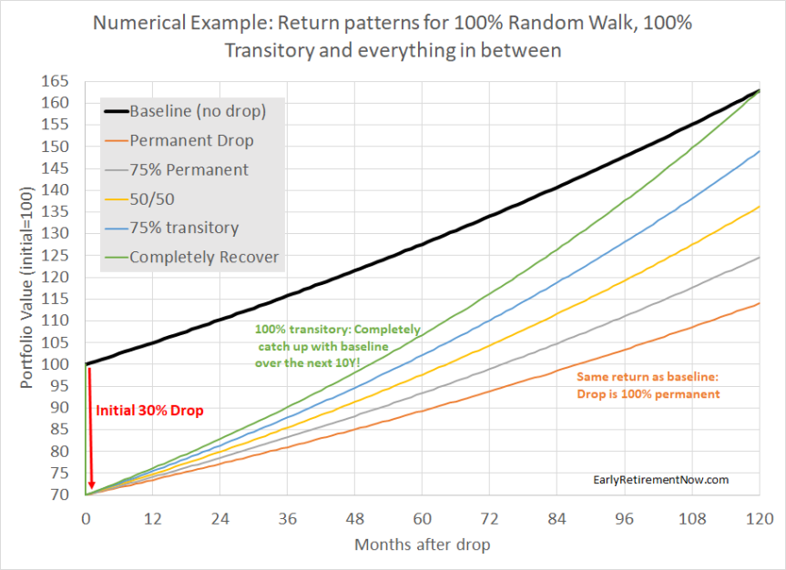
It all depends on how the stock market drop impacts our portfolio return assumptions going forward! Let’s look at the small numerical example. Assume you had expected your portfolio (currently at 100) to grow by 5% p.a. (after inflation) for the next 10 years. But then, BOOM, you get hit by a 30% drop in your portfolio. What happens after that?
- The drop could be 100% permanent. So, even from that decimated level of 70, you still grow your portfolio at only 5% p.a.
- The drop could be 100% transitory, so over some time span, 10 years in this case, the portfolio will recover. Not just the loss but you also reach the same level as the portfolio without the 30% drop after 5% p.a. This would imply an annualized return of 8.81% ( = 1.05 / 0.7^0.1 – 1)!
- Everything in between. I assume 5.94%, 6.89% and 7.85% (compound) returns to reach the 75/25, 50/50, and 25/75 permanent/transitory spots in between.
Let’s look at the different options in more detail:
Extreme 1: The shock is 100% permanent
There are a bunch of different scenarios that would certainly make the loss permanent:
- The 30% loss is due to 30% of the stocks in your portfolio going bust. Well, sorry to tell you, but unless there is some fundamental reason that the bankruptcy of some stocks in your portfolio will make the remaining stocks more profitable this is likely permanent. Same with losing money in Ponzi Scheme or with OptionSellers.com. Keep that champagne bottle in the fridge!
- Congress passes a corporate tax hike that will permanently lower the profitability of publicly traded corporations. The stock market will drop and the lower future profitability will put a lid on growth going forward. Of course, the drop may not be exactly 100% permanent. Maybe investors price in a reversal of this policy. But it could also go the other way around if investors fear even worse tax policy will come in the future. In that case, we could have a drop initially and slower than initially expected equity returns. Ouch!
Extreme 2: The shock is 100% transitory
How is it possible for the portfolio to perfectly recover and reach the exact same final value after 10 years? There are clearly a few possibilities:
- Imagine you own a bond portfolio and hold your bonds to maturity. A change in the interest rate today will certainly change the value of the bonds and specifically, a rise in the market interest rate will send your bond portfolio down. But absent of a bond default you are still earning your interest and get your principal back just as planned initially. This is the definition of a 100% transitory shock!
- A flash crash. Certainly, the convergence back to “normal” will be faster than 10 years. In fact, fast enough that the average FIRE saver will probably not have a chance to react to it and use Dollar Cost Averaging. But one could even argue that the 1987 crash likely was only a blip in a long bull market that ended only in 2000.
Everything in between
As always, reality will be somewhere in between. I seriously doubt that the average bear market will be 100% permanent but, likewise, I don’t think that one can bank on the full convergence back to the old trend growth path. Let’s take a look at the two most recent bear markets. In the chart below, I plot the real inflation-adjusted S&P500 index (dividends reinvested) since 2000. I also add four “trend return” lines starting at the peaks and troughs of the 2000-2002 and 2007-2009 bear markets. As a trend return, I use 6% which is a little bit lower than the very, very long-term average of 6.7% but considering how tumultuous the 2000s were, let’s round that number down to 6%.

In any case, notice something?
- The 2000-02 bear market saw a recovery that didn’t even get close to the previous peak plus trend growth. Sure, there was a slightly faster than 6% recovery from the through, but during the Great Recession in 2007-09 we dropped even below that. Currently, we’re only slightly above the 2002 bear market trough plus 6% growth! This bear market definitely looks like it was mostly permanent.
- The 2007-09 bear market is the exact opposite. We did actually reach the old peak plus 6% p.a. (the black line crosses the dark green line in 2018) and only recently, in Q4 of 2018, dropped a little bit below it again. The jury is still out on how this will work out long-term but unless we get another significant drop (30 or even 50% from here), the 2007-09 bear market seems like a candidate for “mostly transitory!“
Valuation/Mean-Reversion
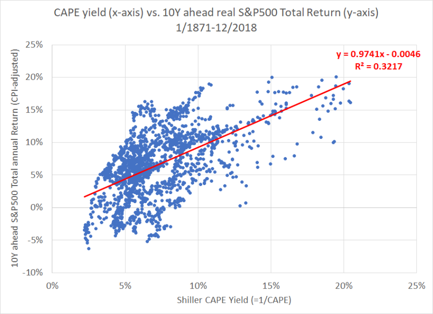
What’s could explain the difference between those two different bear markets? Valuation of course. In 2000, price-earnings ratios were at record levels (Shiller CAPE at 40+) and nobody should be surprised that returns will be less generous going forward. In contrast, at the October 2007 peak before the Great Recession, valuations weren’t cheap but at least they weren’t as outrageous as during the dot-com bubble. More generally, there is a strong correlation between earnings yields and future returns, see the chart below. It plots the Shiller CAPE yield (=1/CAPE) on the x-axis versus the 10-year forward return in the S&P500 (dividends reinvested, adjusted for CPI). On average, a 1 percentage point higher earnings yield has “returned” an extra 1% p.a. S&P500 return over the next 10 years. So, if the S&P drops by 25% and the CAPE ratio falls from 33.33 (=3% CAPE yield) to 25 (=4% CAPE yield) then one could expect a roughly 1% higher return for the next 10 years. That doesn’t completely get you back to where you started but you recover some of that loss; about half of it over 10 years.
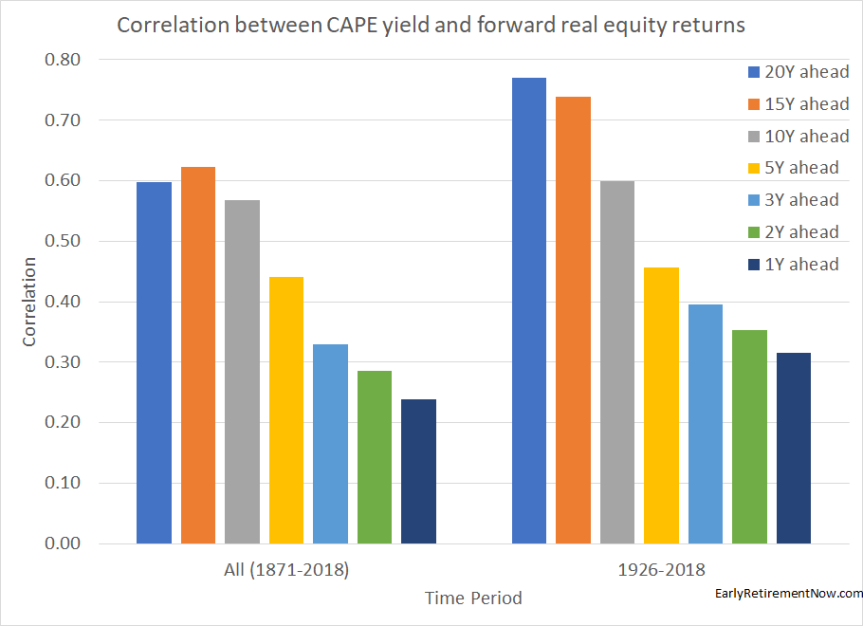
Also, just out of curiosity, over what horizon does the CAPE yield correlate best with future returns? Not surprisingly, the correlations between current CAPE yield and future returns become higher the longer the horizon. Quite amazingly, the correlations level off only when we reach 20-year return windows, see below. Anyone who wants evidence that the stock market is not a mathematical random walk please take a look at those correlations! And check out more evidence in my post from last year!
A Numerical Example
So what does this all mean for investors? Let’s look at a very generic example. It’s intentionally generic and not necessarily trying to replicate what exactly happened in the fourth quarter of 2018. Let’s look at the damage a 30% drop in your portfolio would do for a bunch of different scenarios: a) people at different stages of their FIRE path and b) different degrees of permanence vs. transitoriness.
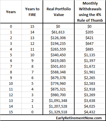
Our generic investor starts with zero assets in year 0 and invests $5,000 per month (adjusted for inflation). He/She plans for a 5% p.a. portfolio return (after inflation) and saves for 180 months (15 years), so without any market crash in between the path of the (real CPI-adjusted) portfolio is as in the table below. After 15 years the portfolio is large enough to sustain a $4,432 monthly withdrawal under the 4% Rule of Thumb. And I know about the limitations of the 4% Rule, so don’t make me go there 🙂 !!! In any case, that’s is a nice enough retirement budget. So, let’s assume that our investor will retire after 15 years of accumulating assets.
How do we model the sequence risk? Let’s assume that at each of the 16 stages of preparing for FIRE we check the impact of a 30% drop in the portfolio value plus a subsequent trend return path of either 5%, 5.94%, 6.89%, 7.85%, and 8.81%, corresponding to the 5 different assumptions about permanence vs. transitoriness. How does the portfolio value 10 years down the road compare with the one without the crash and with constant 5% returns? So, for the 16×5=80 different combinations, what’s the percentage benefit (positive or negative) of the crash?
Example: You’ve saved for 9 years on your path to FIRE (=6 years before FIRE). Your portfolio of $679,378 takes a hit of 30%, but you keep saving your monthly $5,000 for 6 more years and then retire and withdraw the $4,432 as initially planned. How much money will you have exactly 10 years after the crash (after 6 more years of accumulation and 4 years of withdrawals)? Assuming the shock was 50% permanent, 50% transitory (6.89% returns for 10 years), the final portfolio value is $1,260,781. That’s about 9% lower than without the crash and 5% returns ($1,380,660). So, the rows correspond to the different stages of FIRE (15 years to retirement all the way reaching FIRE) and the columns for how permanent vs. transitory the crash was: all the way between 100% permanent to 100% transitory in 25 percentage point steps. At 6 years to retirement and 50%/50% permanent/transitory, we find that exact -9% number we calculated in the example above.
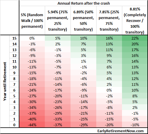
The key results from this table:
- If you’re still 10+ years away from Early Retirement you can benefit from a drop in the portfolio if you assume even a moderate level of mean-reversion. This is what I was talking about in the ChooseFI podcast two weeks ago. The market doesn’t even have to perfectly catch up to the baseline and you still come out ahead. It’s the one occasion where Sequence Risk works in your favor!
- And obviously, if you’re now retired or even close to retirement (1-2 years before retirement) then you’re essentially guaranteed to lose. Even if we assume the shock will perfectly mean-revert over 10 years!
- For everyone in between, say, 3-10 years away from retirement, there is great uncertainty as to whether the 30% drop is something to cheer about or be afraid of. It all depends on how permanent of transitory the drop is!
- It’s also interesting and informative to look at where the cross-over points are. Say, if you got 10 more years to go, how permanent/transitory would the shock have to be to still come out ahead? Roughly 50/50. Or if you believe the shock is mostly (75%) transitory how many years prior to retirement do you “break-even?” Roughly 6 years prior to retirement.
Conclusions
Others have written about this topic. But I think they have done so only very superficially. Here are two examples:
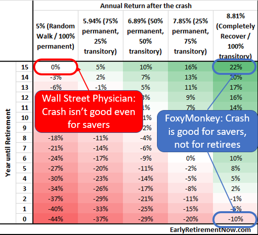
- FoxyMonkey recently posted Why a stock market crash is actually good for you and, no surprise, savers benefit from a crash that perfectly mean-reverts and retirees don’t.
- Wall Street Physician had a post in 2017 on why even young investors shouldn’t hope for a crash. Perfectly true if you assume that the stock market follows a strict Random Walk!
Wall Street Physician quite correctly points out that most crashes are certainly not 100% mean-reverting. But just because a crash is not perfectly mean-reverting doesn’t imply that it has to be 100% permanent all the time. It’s a false dilemma fallacy! The stock market is not a perfect random walk (see my post from last year) and consequently, one should certainly raise return expectations after a big stock market drop.
We’re all at different stages on our FIRE path and the average crash is somewhere between 100% permanent and 100% transitory. The pros and cons are a lot more complicated than the three “obvious” corners covered in the “analysis” you see out there in the personal finance blogosphere (see the chart below)! The pros and cons depend on how permanent/transitory the crash is and where you are on your FIRE path.
You put some real analysis here and I’m glad to see more numbers, Ern. I guess the key takeaway here is that the stock market will eventually gravitate towards the fundamentals. Earning’s growth, GDP, unemployment rate, etc as I mentioned on the article. Therefore, stock market drops when the fundamentals have not changed should be seen as “Sales” because the underlying stock value has not changed (just the price!). These market drops gear more towards the transitory end of the spectrum.
But transitory drops are not always the case and the closer you are to retirement the more impact the drops will have. An interesting metric would be this: “What’s the permanent/transitory percentage of stock market drops (say >20%) on average?”. In other words, this will tell us the likelihood of a drop being permanent or transitory if history is any guide…
Thanks!
Very true! So, I was surprised that even during the Great Recession we converged back to the old 2007 peak plus 6% real growth.
I haven’t done any careful analysis on what’s the average % of recovery from the 20%+ drops. Interesting suggestion! I will put that on my to-do list! 🙂 Thanks!
One additional big thing to consider is that savers early on in their journey likely aren’t contributing as much to their retirement as they will be down the road. If you’re in a field where significant raises are the norm, your 10 year outlook is going to be different from someone in a career where COLA raises are the norm. In a case where you are likely to be contributing a greater amount later on, a transitory stock crash is likely to be of greater benefit to you.
Of course, if you plan to quit your high paying job and move into more of a part time or lower paying role as you approach retirement, the opposite will be true.
I assumed that the contributions are adjusted for inflation (COLA), hence the relatively modest real return of 5%.
Of course, most people will likely get pay raises and promotions that grow income way beyond the CPI. That would certainly have the impact you mention. I didn’t model that to stay as generic as possible and to make the case for a “benefit of a crash” as hard as possible. 🙂 But even with those conservative assumptions it was possible to benefit from a crash!
Financial Mentor does great analysis on sequence of return risk, which includes what a market downturn does to your retirement portfolio when you’re at or close to retirement. It was a real eye-opener for me to see how much timing of a downturn impacts some of these rule of thumb calculations, like “4% withdrawal” rate. Our portfolio is weighted about 60% majority in cash-flowing real estate, so we plan not to touch our stock portfolio for many years, if ever, even though we are at the FIRE stage, Instead we’ll rely on our real estate and our part-time work for the day-to-day. This doesn’t make our portfolio recession-proof but it makes us less sensitive to market shocks. All the recession does make me want to step up on the part-time projects however!
Hi, can you please post a link to his analysis ? Thanks
Financial Mentor has mentioned Sequence of Returns Risk multiple times, but this article is a good explanation. Jump to page 8:
https://financialmentor.com/wp-content/uploads/Sample-The-4-Rule-and-Safe-Withdrawals-Todd-R.-Tresidder-Financial-Mentor.pdf
Nice! Thanks for the link!
Very true! Real estate is a nice asset class and I plan to add more to our RE stash. For those who want to stay in the pure paper asset class, it’s not a bad idea to have a sizable bond portion right around retirement. But note that it’s ideal to move back into stocks eventually. See parts 19-20 of my SWR Series (glidepaths)!
Bravo! A SUPERB piece of analysis that every person at or near retirement ought to read!
ERN, can you compare this (on an after tax basis) with the Meb Farber strategy of selling 100% of Stocks when the S&P 500 Index drops below its 200 DMA, temporarily going to Tbills, and re-entering the Stock market when the Index recovers above the 200 DMA?
Thx
Venkat
do you mean this? https://earlyretirementnow.com/2018/04/25/market-timing-and-risk-management-part-2-momentum/
Yup, that’s the link! Thanks for sharing!
See here: https://earlyretirementnow.com/2018/04/25/market-timing-and-risk-management-part-2-momentum/
It’s an intriguing strategy but I’d be cautious about the prospects about this working relliably going forward. Too many others are trying the same thing. Once people point out an anomaly like this it will go away! 🙂
Hi ERN, regarding retirees, how much can an asset alocation strategy help stretch out their savings despite such crashes ? In practical terms, it would be the time to sell bonds and buy stocks. Congrats on the article.
I wrote about shifting between stocks and bonds in parts 13, 19 and 20 of the SWR series. If the crash is short-lived enough then it certainly makes sense to first sell bonds.
But: It will not make a huge difference (i.e., if the SWR was 3.5%, then some scheme like this will not suddenly make the 4% rule viable again). Any scheme like this one will raise the SWR by maybe 0.05 to 0.10 percentage points. Better than nothing but not really a panacea! 🙂
Thanks ERN, I couldn’t agree more. I bet you that if you would use a CAPE-based SWR rule, and look at the expected income stream, rather than portfolio value, things would look much much better as well!
Very good point! A SWR based on the CAPE will certainly work well for retirees. At least you pick a reasonable initial SWR, suitable for the prevailing market conditions. And then if things don’t work out, the drop in withdrawal amounts is likely only moderate. Much more manageable than starting with 4% and then having to drastically cut consumption when things don’t work out.
Very thoughtful post, as always. A few thoughts…
On positioning relative to retirement, I’m in total agreement. Nicely said.
On permanence versus transitory, I wonder if this is the best framework to think about the market. What about the simpler framework where valuations are either above or below a long-term fundamental trend — more like cycles in valuation multiples? The bear case isn’t whether a decline is permanent or transitory, but more whether valuations are “normal” or “way above normal” (though, I recognize that we could probably agree on the same underlying processes that produce either way of thinking about this).
For example: On your first chart, I don’t think the question is whether we revert to a 6% growth from a possible market peak. Isn’t it easier to think about things as being above-trend (starting at 30% or even 100% *above* the black line), and then reverting back to a more median long-term valuation multiple? In other words, the colored lines starting above trend and coming back to trend as opposed to starting below trend and figuring out how much they’re moving up. Similar point on the second chart: I worry that drawing a 6% growth from the Internet Bubble peak (2nd picture) makes things look less overvalued than they are.
Regardless, you’ve made some great points here and have got me thinking. Good stuff!
DeForest
Thanks! Very good points! In general, I definitely think just like you about being above trend (2007) and being below trend (2009). But what’s normal? I chose the easy way out that let me analyze the two bear markets without having to take a stance on what’s a “normal” earnings multiple. Some people will argue 15x EPS and that would mean that we’re constantly above normal.
Also, the “analysis” of starting the trend lines at the peak/bottom corresponds to the naive “random walk” way of thinking and I wanted to see to what degree that’s confirmed or refuted in the long-term.
All good points! I guess where I’m getting hung up is that the right framework seems to be more like this: Are stock prices overvalued, undervalued, or properly valued relative to fundamentals?
Whereas the framework you’re explaining makes an implicit assumption of a current steady state: If we drop from here, are we likely to swing back or stay put? I see the relationship between them, of course, I just think the overvalued / undervalued paradigm is easier to think about, and doesn’t as easily imply that we’re at a steady state.
Anyway, just sending food for thought. Your post was very thought-provoking. Thanks again!
Yeah, I see how the two are related. Since I wanted to display results in the table in the spectrum permanent vs. transitory I did the study my way.
But I agree that what CAUSES the shock to be more transitory vs. permanent is certainly related to valuation. Maybe it’s ALL valuation.
That’s a pretty interesting thought, in my view. I used to think that, yes, it’s all valuation. But look at any long-term valuation chart, like a Shiller 10Y PE chart, and the market looks super overvalued right now. And that hasn’t stopped the market from going up year after year — much of which I’ve missed out on by being light in stocks (though I’m heavy in real estate, so it’s been fine).
It has me thinking more these days: what are the “normal” valuation levels? Is the historical comparison on target? Is that even the right way of thinking about it? You can only hold a view contrary to the market movements for so long without questioning yourself. I’m definitely not positing a cycle or valuation framework of the markets as “correct”, but it’s a different mental framework, I think, than transitory versus permanent shocks.
Anyway, thanks for the responses and good insights. Have a great Friday!
We think very much alike – no surprise given our backgrounds! If I look at the time series of the CAPE there seems to be a structural break sometime around the 1990s. Before that, a “normal” CAPE would be around 15-17, For the last 20+ years it’s more like 20-25.
There are some fundamental reasons why we could have that structural break: more conservative earnings definition and a lower dividend payout ratio. If that justifies a rise in the normal CAPE by that much, I don’t know. But it definitely looks like the CAPE has been behaving like this for multiple market cycles now.
Lots of things to write about in future blog posts! 🙂
Thank you for quantifying this reverse sequence of returns risk – looks like all the more reason to implement a bond tent running up to FI date
Very good point! SWR series 19-20 show that it would alleviate at some of the sequence risk!
I love this blog’s quantitative answers. How many years before FI date would you recommend starting the 60 to 100% glide path you found optimal in SWR series 19-20? And would you increase the duration of the glide in this case?
I always say it depends on how flexible you are with your retirement date. If you are flexible but like to reach FIRE as quickl as possible, then stay 100% equities for as long as possible.
But if you’re dead-set on a particular date, start shifting 3 years or even 5 years before the specific date to avoid the bad luck/Sequence Risk.
This is exactly why my “FIRE number” will be based on spending / earnings per share = number of shares to FIRE. This makes much more sense than relying on market prices to predict the odds of a 40 year portfolio prematurely depleting.
Earnings eventually come back to stockholders through corporate reinvestment, buybacks, dividends, debt reduction, share appreciation, etc.
E.g. Let’s conservatively say the S&P 500 has generally earned roughly $120/year for the past couple years. ( http://www.multpl.com/s-p-500-earnings/table ) The ETF “SPY” is approximately one tenth the value of the S&P 500, therefore a share of SPY controls about $12 in earnings. If my expenses are $50k, then I need $50k / $12 = 4,167 shares of SPY to retire.
That’s a goal I can work toward and measure progress against regardless of whether the market is rallying or correcting. I can also sleep well through the worst market panics knowing that although my market value has changed in the short term, my earnings will be just fine in the long run.
Very good point. Related to the CAPE-based SWR! But going purely by earnings, note the big drop from 2006 to 2008: 101.8 ->17.84 = 80+% drop that didn’t catch up until 2018, when adjusted for inflation! So, earnings will go back to “normal” in the long-term but “long-term” can be a long way away! 🙂
Hi ERN, I’m 63, have reached FI, live modestly, although housing costs expensive in Long Island NY, still plan to work 2-3 more years, will have small (22k) private pension at age 65. Because the CAPE is still high relative to historic levels, I’m thinking that one of your rising equity glide path scenarios from your SWR series is the best approach for my situation. 💲🙂
Nice! Bonds definitely worked well as a diversifier in Q4 2018. Glad you found this helpful!!!
Let’s say you are exactly 10 years from retirement…and what if there are two crashes in that ten year period (similar to the first decade of this millenium)? Can we look at the case if the first were more permanent, the second more transitory? How about the reverse? How does this change things?
Interesting question. Depends on the exact starting dates. I personally started investing with serious money (from my first real job) in September of 2000. I went through two crashes (2000-2003 and 2007-2009) and my personal IRR was great due to Dollar Cost Averaging. Much higher than the point-to-point S&P500 return even though I mostly invested in S&P index funds.
And for retirees, this period would have been a disaster. Check out the Google Sheet (SWR series 28) and run your own case study to see what I mean! 🙂
I would like to see an analysis of repeating 2000-2018 periods DURING the withdrawal stage.
Great question! Check out Part 6 of the SWR study:
https://earlyretirementnow.com/2017/01/18/the-ultimate-guide-to-safe-withdrawal-rates-part-6-a-2000-2016-case-study/
You can also do your own case study with the Google sheet (see part 28 for the link)
Long story short, the 2000 cohort didn’t fare very well. Depending on the S/B allocation you would have depleted 35-50% of your portfolio (in real terms). If you still withdraw the initial 4% plus CPI-adjustment you’d probably have to cut by now if you still have a 30-year horizon as of today. But 65-year-old retirees in 2000 could potentially make it through without running out. If they have now only a little more than 10 years left…
Very interesting as always.
I wonder if the stock market will fully recover this year or not. I’m currently sitting with cash and hesitate between real estate and the stock market.
I doubt we’ll jump back to 2900+ in the S&P this year. But 6%+ would already be great.
Great piece. I particularly liked the SP500TR vs peak/through trend return graph. Mind blowing!
Thanks, TA!!! Glad you found this useful! 🙂
Overall, I appreciate the analysis to quantify how much of a “correction” and when the correction happens vs the larger impact on the FIRE portfolio. I’ve shared some of your previous posts with friends pursuing FIRE since you do such a great job crunching the numbers and then showing the results of that analysis in an easy to understand manner.
Thank you for another interesting, data-based discussion.
However, I must be missing something simple, because I expect a connection between your scatterplot graph and the following bar chart, but I don’t see that connection. My specific lack of understanding is:
I believe the scatterplot is intended to show the 10 year ahead CPI-adjusted (i.e. real) returns vs the CAPE yield from 1871-2018 and the best-fit line has R^2 (i.e. correlation) of 0.32.
Yet, when I look at the subsequent bar chart (left side, data set = 1871-2018) at the grey bar (10yr ahead real return dataset), the bar’s correlation (height) is ~0.57.
So, for the 10yr ahead real return vs CAPE yield for the 1871-2018 data, the scatterplot shows a correlation of 0.32 while the bar chart shows a correlation of ~0.57.
I notice that the scatterplot specifies “S&P500 Total return” while the bar chart says “equity return”, so maybe the two sets of data are not identical, thereby causing the difference in correlation (for what I thought would be two identical sets of data)?
The scatter plot displays the R^2. The bar chart the correlation. In a uni-variate regression the R^2 is the correlation squared. So, the correlation of about 0.57 implies an R^2 of 0.3217.
Love your contributions and grateful that you are continuing to make them notwithstanding your early retirement.
Does this analysis change your prior conclusion that a 4 per cent WR beginning after an equity drawdown of at least 25 per cent has always succeeded?
(Also, if I’ve misstated that, please correct me. In particular, do the words “at least” belong in that sentence?)
Asked at a time when we have an equity drawdown of about 10 percent.
Put another way, how does this latest analysis change your prior SWR analysis, if at all? Or do you stand by your prior SWR series? I’m not doubting you, just asking, as your SWR series is terrific.
It seems to me that using the Shiller CAPE ratio to derive one’s SWR handles efficiently, for a near-retiree, the issues about valuation that you are addressing in this piece.
Mentioned because I have no reliable way of knowing whether the next bear will be mostly permanent versus mostly temporary, but I think I know that the Shiller Cape ratio presently is high (as in 2007) versus absurdly high (as in 2000), and I can adjust my WR accordingly for a hypothetical 2019 retirement.
Very good question! As I wrote in the various parts of the SWR series, valuation matters. So, if the market were to drop my analysis doesn’t change. The sustainable WR changes. Do you notice the difference? Changing sustainable WRs is part of the plan. So, again, the analysis is the same it just responds to the changing market realities.
I have no reliable way of telling what’s transitory and permanent either. Using a CAPE-based rule with a multiplier of 0.5 on the earnings yield you’d pick a point in between. It has worked pretty well in simulations. It’s basically the midpoint between a VPW (bogleheads) rule (=assuming everything is 100% permanent) and the traditional 4% Rule (assuming everything is 100% transitory).
Thanks Big ERN, I really liked your approach. It makes me wonder if coating the asset allocation with an increasing exposure to trend following as we approach retirement age (then decreasing it as we grow older once sequence risk’s threat is lessened) would optimize protection against a permanent drop.
Good question! I’ve done some quick calculations and found that trend-following indeed helps with sequence risk. Don’t sweat it when you’re just starting out, but right around the retirement date you’d benefit the most from it.
One caveat: There is no guarantee that such a simple mechanical strategy will work going forward!
For what it’s worth as an example to share with FIRE community, invite feedback, comments:
– I’m 63, will work 2-4 more years. 90k salary.
– 2.75M portfolio.
– 20 / 80 equity / fixed income allocation due to high current CAPE (~30).
– Doing rising equity glide path to 60 / 40 by age 75 (due to high CAPE; sequence risk).
– plan for 35 year retirement in case I leave / lose job today.
– monthly expenses $9k including taxes owed.
– plan 3.25% initial withdrawal p.a. with cola.
– portfolio depletion at end of retirement.
– .0325 x $2.75M = $89k first retirement year.
– 22k p.a. private non-cola pension at age 65.
– 30k p.a. social security at age 66 & 4 months.
– this all should produce 11-12k per month initially.
– I think I should be ok.
– comments, feedback?
Thanks for sharing! Looks like you’re in great shape. You could easily retire today due to the high future cash flows (pension + SSA).
With the high Bond portion, you minimize volatility in the short-term very well. But you also limit how much money you’ll leave to your estate. But that sounds like a trade-off you make consciously.
Brilliant post. For years I have been wondering how those on the path to FIRE would deal with big drops in the market, given that one tenet of FIRE is to “retire early” on a relatively short time frame of investing. After reviewing the historical data (and presuming that is a good guide to use going forward) it would seem to me that to “guarantee” a positive return you need to invest for at least 20 years. There are at least a few periods in the history of the market where stocks essentially returned nothing for 20 straight years or more. How do those on the FIRE path know whether they are in the midst of such doldrums?
You’re right that saving for retirement is also subject to some market uncertainty. So, not everything is as automatic as Mr. Money Mustache wants to make it (see his shockingly simple math post).
I wrote a post about that topic:
https://earlyretirementnow.com/2017/11/01/shockingly-simple-complicated-random-math-behind-early-retirement/
In particular, see this table:

Years to FI for different savings rates: The range of outcomes: minimum vs. median vs. maximum number of years by CAPE regime. 100% equities, 0% bonds. 1871-2017.
Excellent. I am new to your blog so thank you for sharing this past post. Exactly what I was looking for.
Glad you liked this! 🙂
Achieved “FI” by being very focused on diligently dollar cost averaging investing over many years during the 80s and 90s and 00s, and living frugally. Because always lived in the expensive NYC tri-state area, high rents and housing cost, decided to postpone the “RE” which would have required relocating to a lower cost of living area as ERN did. May still do this. Been researching. For me the FI is a bigger satisfaction than the RE. Good luck and best wishes on your own journey.
Nice! Good luck with your own financial journey. I had a great run for the last few years in my job after I hit FI and had to worry less about job security. But at some point, when I could afford to “get annoyed” about certain things in my job, I eventually did. So I pulled the plug in 2018.
But good for you that you keep working and supporting the federal tax base for the slackers like me. 🙂
Since 1932, the market has produced above average 1, 2, & 5 year cumulative market returns after the advent of “largest” quarterly losses ( 4th quarter 2018 being most recent ) accompanied by a subsequent S&P 500 price cross above long period moving average, monthly basis ( S&P 500 moving average at 2730ish at present ). https://imgur.com/a/Eoj26AS
Additionally, since 1954, from November of the mid term election year to the end of the Presidential election year, the buy and hold of S&P 500 produced total average returns of 37.5% over 16, two+ year periods ( a 94% statistical assurance – with one losing period from Nov 2006 – 2008 with strategy signaling going to defense Jan 2 2008 ). This phenomenon most likely occurring because an accomodative Fed has provided assurance for the incumbent Presidential party for the election year, although this is anecdotal.
https://imgur.com/a/C1kT2Xh
With the markets being more institutionalized than ever, and more investors retirement money being “passively” tied up in the market, it is doubtful that the powers that be wouldn’t provide “easing” support under the market in times of stress.
Interesting stats! Thanks for sharing. The first quarter certainly looks it’s on to a good start, so let’s hope the Q4 mess was just temporary!
We are used to 4% productivity. Imagine you retired in 1990 (29 years ago) with half in S&P 500 and half in Nikkei 225. Take nothing for granted. Great article.
Thanks! Knock on wood, we did pretty well with the U.S. stock market. At least every bear market reversed after a while!
Thanks for sharing informative Stock Market Blog.Following these blogs helps in knowing the secret of success, business insights respectively. In this trending era people seeking marketing experts guidance for stock market investment.