
February is “Macroeconomics Month” on the ERN blog! And the topic of inflation fits right in. My blogging buddy Actuary on FIRE suggested doing a series on the “Inflation Risk for Early Retirees” and I like that idea because this topic hasn’t gotten all that much attention in the FIRE community. Even though inflation is a top concern for 78% of retirees, according to this recent article.
In addition, the topic is not just extensive enough to span multiple blog posts, but it also greatly benefits from the viewpoints of two experts in their respective fields: An actuary and an Econ Ph.D. each with their own expertise in number crunching. AoF started the series last week with the introductory post, Part 1, and this week it’s my turn. Just like AoF, I like to start setting the stage and give a little bit of an overview – think of this as another introduction to the inflation topic, just by a different kind of numbers geek. So, today I’ll take a brief look at the U.S. inflation history and the different ways inflation can ruin our retirement. Let’s jump right into this…
147 years of inflation: A Brief History
Let’s look at a very long time series of the U.S. CPI (Consumer Price Index). In the chart below is the CPI normalized $1 in 1871. So, one can think of this as the price of a $1 basket of goods over time, though the basket obviously changes over time; fewer horse buggies and more consumer electronics in 2018! And just to be sure, the actual CPI series as constructed by the U.S. Bureau of Labor Statistics starts only in 1947, but some smart economists have backfilled the data all the way back to 1871, see data from Robert Shiller (in the same file as the CAPE estimates). It looks like inflation wasn’t much of a problem during the first half of the sample. Between 1871 and the early 1940s the CPI moved sideways, with a few small wiggles. Then came a gradual increase until about 1973, followed by a rapid CPI rise during the two oil shocks and a steady increase ever since.


Why is that chart slightly misleading? Well, let me display the exact same data but in a very different format. Instead of the cumulative nominal cost of that representative basket of goods, let’s look at the year-over-year inflation rates. And throw in the 5Y and 10Y average annualized inflation rates as well. Suddenly, the last 30 years don’t seem quite so scary anymore:

Sure, inflation chipped away a modest percentage every year since the 1980s, about 2% on average, but the fluctuations were pretty modest. I take that over the crazy CPI fluctuations in 1870-1950: between -20% and +24% year-over-year – good luck holding nominal bonds during that time! And the runaway inflation during the 1970s wasn’t much fun either. So to everyone complaining and worrying about inflation today, I can offer some consolation: I take our current inflation environment over those in the past!
But I don’t want to belittle inflation. We are still left with losing about half of our purchasing power over a typical 30-year window. And it looks even worse if that window includes the 1973-82 period. Over 50 years, we’ve lost more than 80% purchasing power!

Why the wide swings in the chart above? Compounding! To demonstrate this, let’s look at how $1,000 is slowly inflated away over different time horizons and for different inflation rates, see table below. Over 60 years, going from 2% to 2.5% inflation means going from $304.78 to $227.28 real purchasing power. Small differences in inflation compound to large effects over the decades! It’s one of the reasons why I’m not a big fan of (nominal) annuities; they may give me some cash flow certainty in the short-term but I can’t forecast inflation decades ahead and find the risk to long-term purchasing power too large!


Summary so far:
Inflation can ruin our retirement in (at least) two ways:
Inflation risk #1: If we ignore inflation altogether we’ll be surprised by how much inflation will likely chip away from nominal values, e.g., pensions and annuities that lack cost-of-living-adjustment (COLA).
Inflation risk #2: Inflation uncertainty. Even if I do make allowances for some trend inflation rate over the horizon of our retirement, small variations in the actual realized inflation rate can cause huge changes in my future purchasing power.
But not all is lost. Here’s how I sleep soundly at night despite inflation:
How I personally stopped worrying about inflation: Simply use inflation-adjusted returns!
Obviously, this is a little bit tongue-in-cheek, but there is still some truth to it! Our money won’t sit around in a checking account with zero interest to be slowly eaten away by inflation. We put the money to use in high-return investments that hopefully beat inflation over the long-haul! Let’s look at the chart below. It plots the CPI index since 1871 again and both the nominal and real S&P500 (total return, i.e., with dividends reinvested). All normalized to $1.00 in 1871.

Clearly, this asks for a log-scale on the y-axis because since 1871 a single dollar invested in the stock market would have grown to a staggering $285,000 by the end of 2017! It sounds like a lot, but this is still “only” 8.9% annualized compounded return! But even after inflation wipes out roughly 95% of the value of the dollar, that single dollar investment would have still grown to more than $14,000, about 6.7% annualized. And that came as a nice and steady growth path along a straight line on the log-scale (i.e., exponential growth in real dollars). In other words,
Equities are an excellent inflation hedge over very long horizons!
And they should be because corporations will face price increases both on the cost and revenue side, so over the very long-term, corporate profits will definitely catch up with inflation.
But as one semi-famous economist once said, “In the long-term, we’re all dead!” I’m the first to admit that inflation can do and has done damage to equity portfolios in the past (and I’m not looking at bond portfolios yet!!!). Most recently, in the 1970s and early 80s: Inflation was high and coincided with poor real equity returns. And sure enough, the 1970s were one of the examples where the equity and bond portfolio drawdowns were bad enough to wreak havoc on retirement portfolios. That flat-to-slightly-down path of the (real) equity portfolio created some serious Sequence of Return Risk! So, in one of the future posts of this series, I’ll certainly write some more about how I think about hedging against inflation risk over shorter horizons. Stay tuned!
How I account for inflation in my Safe Withdrawal Rate Series
One other issue I wanted to address is how I run my simulations in the Safe Withdrawal Rate Series, especially how I would account for inflation. This issue also came up after I did the ChooseFI podcast last year. I replied to that and Jonathan and Brad read that reply in the Episode 35 Roundup, but here I can elaborate some more. Let’s look at the simple example below I display the (nominal) portfolio returns and year-over-year inflation rates. Of course, I always do my simulations at a monthly frequency but for this simple exercise with “made up” data, I’ll use annual data. In the column on the right, I calculate the real year-over returns, not by subtracting CPI inflation from the nominal return, but through compounding. I include the formulas in the table for the numbers geeks.


And now there are two ways to calculate our withdrawal calculation
Method 1: With nominal numbers. I inflation-adjust the withdrawals and then iterate forward the nominal portfolio values by via
P(t)=[P(t-1)-W(t)] * (1+r(t))
See table below. Notice something? The nominal and real portfolio values start deviating substantially over time! While the nominal value reaches the $1m mark again, the real portfolio is still lagging behind!


So, in other words, here is another way inflation can mess with our early retirement:
Inflation risk #3: Adjusting the withdrawals for inflation but forgetting to do the same for the portfolio value! It would be too tempting to claim success for the 4% Rule in the numerical example above. The portfolio recovered back to the initial $1m value but only in nominal terms! Now the 4% has become a 5% rule! Specifically, we’re withdrawing $50,781 out of a $1,001,852 portfolio (in nominal terms) or – equivalently – we’re withdrawing $40,000 real dollars out of a $769,900 portfolio!
Method 2: With Real, Inflation-Adjusted Numbers. The way I normally run my SWR simulations is to express all values in real, inflation-adjusted terms and then use the same formula again P(t)=[P(t-1)-W(t)] * (1+r(t)):
- Real withdrawal amounts, $40,000 fixed in this example, but I can vary that, too, and allow increasing or decreasing real consumptions amounts or factor in future supplemental payments. See my Google Sheet toolbox (SWR Series Part 7) for calculating safe withdrawal rates.
- Real inflation-adjusted returns, i.e., from the right column in the first table: rr(t) = RR(t)/RR(t-1)-1.
- Real portfolio values.
And the simulation is in the table below. Everything is ready to use in real dollars and comparable across time. And there is no way I could bungle the real vs. nominal portfolio values. Also, notice that the real portfolio values are exactly identical to the ones in the more cumbersome calculation that goes through nominal values first:


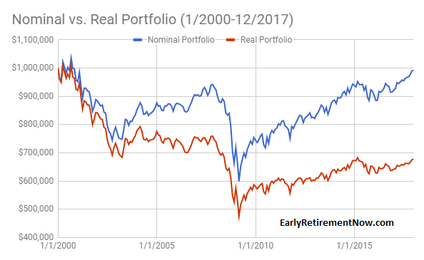
How common is it to confound nominal and real portfolio values? Well, one prominent example is Michael Kitces’ post on how the 4% Rule held up since the Tech Bubble. Kitces makes the very valid point that a retiree starting with a 4% withdrawal rate in 2000 – at the peak of the Tech Bubble – would have recovered almost all the losses from the two big bear markets by now. But that’s in nominal dollars (!!!) and he makes sure to mention this in his blog post:
“Of course, an important caveat to the chart above is that it’s based on ‘nominal’ dollars, not adjusted for inflation. Which is important, because it means that retirees who had similar portfolio balances after the first half of retirement were not necessarily going to have the same buying power with those dollars for the rest of retirement (because of what inflation had been in the first half of retirement).” From: Kitces.com
But nevertheless, people in the FIRE community still frequently read past that paragraph and claim that this demonstrates the sustainability of the 4% Rule. But it doesn’t! At least not for early retirees. And inflation is to blame! I recently ran the numbers again (to update the numbers from the blog post in Part 6 of the SWR series), simulating a 60/40 portfolio, $1,000,000 initial portfolio value and $40,000 annual withdrawals (adjusted for inflation post-2000) and indeed the nominal value is now $992,000. Within striking distance of the initial $1m portfolio value! But in real terms, we’re still at only about $677,000! In other words, one would now withdraw almost 6% of the current portfolio value (40/677=5.9%), which may be OK for a 65-year old starting out with a 30-year horizon in 2000 and who has to fund retirement only until the year 2030 or so. But not so much for early retirees who still would have to make the portfolio last until the year 2050 or 2060!

Conclusion
So much for today! This was just a brief history of U.S. CPI inflation and a few of my thoughts on how inflation can mess with retirement, especially over the long horizon we face in early retirement. Stay tuned for more parts in the coming weeks. We’d also like to hear your suggestions for other inflation-related topics!