


“The recession is near!” Headlines like that have become more common recently. And I’m not talking about those ridiculous “sponsored posts” on Yahoo-Finance (“Reclusive millionaire’s warning: get out of cash now”) but the actual news; the Yield Curve inverted recently and then you add the “Trade War” and weakness abroad and everybody gets nervous. Even the U.S. Federal Reserve is nervous enough to start lowering rates again; one cut already in July and another 0.25% cut likely coming tomorrow! So, will the longest-running economic expansion end of “old age” soon and cause a sizable market correction? Or a bear market? Or a market crash? Should we even care? Since lots of readers have asked me to weigh in on those issues I thought this might be a good time to write a post on this.
First of all, hell yes, we should care. If the economy really goes South and the stock market with it, that would be detrimental for retirees and even folks well before retirement. Fortunately, despite all those bad headlines, I’m still sleeping well at night. Sure, the outlook has worsened since earlier this year and I am a bit more worried about the market now compared to before. But I’m still not too concerned in absolute terms. And my view is mostly based on economic fundamentals. Notice how that view is different from some places in the FIRE community where “no worries” has become something of a mantra. The standard applause line there is that “the market always recovers, so we don’t have to worry about a bear market!” But that’s really a strawman argument. Nobody ever argued that we’ll have a recession and a permanent bear market that we’ll never recover from! The stock market is tied to macroeconomic fundamentals and as long as the economy grows we can be confident that the market keeps delivering. But eventually getting back to the old peak is a pretty lame criterion. Why? Let’s look at the chart below from my post earlier this year, but updated to 9/13/2019. It plots the real (inflation-adjusted) total-return performance (dividends reinvested) of the S&P 500 since 2000.


Of course, the market recovers eventually. But it may take a while! The index didn’t reach the 2000 peak until 2013. And a zero-percent real return over 13 years is a pretty lousy goal. Or here is another way to look at the chart: Let’s start at the peak in 2000 and assume the 2001 and 2007-2009 recessions had never happened and the index had instead advanced at 6% per year (even a little bit less than the long-term average). We’d be 50+% richer today. Don’t tell me recessions and bear markets don’t matter! Also, we did catch up to the 2007 peak plus 6% growth, but even that took about 10 years. So, yes absolutely, recessions and bear markets matter because of what they can do to our retirement plans, compliments of Sequence of Return Risk.
I’m just pointing this out to stress that I’m not categorically unconcerned about a recession. I just don’t see enough evidence yet to run for the hills. Let’s take a look at the details…
Where are we now? Update on my three favorite macro indicators
In early 2018, I published two posts to showcase how I think about the connection between the macroeconomy and my personal finances:
- Joined at the hip: The Macroeconomy and the Stock Market: We obviously go through equity market fluctuations, even corrections and bear markets all the time. But from a Sequence Risk perspective, the only market events we really have to worry about as a retiree (or someone close to retirement) are the bear markets that coincide with recessions.
- Market Timing and Risk Management – Macroeconomics: Here I detail what would be good indicators to at least get an initial idea on whether we’re even close to a recession. I presented my three (yes, only three!!!) favorite macro indicators that I follow to get a sense about the health of the economy. Quickly, because I’m retired and don’t have time to follow hundreds of indicators!
So, how are those three indicators holding up as of September 2019? Let’s go through them one by one and assign a letter grade (A-F):
1: The Yield Curve (Grade: C-!)
A yield curve inversion, defined as a negative slope between the 2-year and 10-year Treasury yields, has preceded each and every recession in recent history, see the chart below.


In this monthly chart, you don’t even notice the very brief inversion in late August. In the chart below, I plot the 10Y and 2Y yield and with a magnifying glass, you can see that the very short inversion. But in September, the yield curve “normalized” again and the 10-year yield is now back above the 2-year yield.

What do we make of that? Does that qualify as a bona fide yield curve inversion? Should we be worried about this inversion? I’m obviously marginally more worried than when the yield spread was at +0.20% but this short-dated inversion doesn’t seem like a reason to run for the hills yet. To put this short-lived yield curve inversion into perspective, let’s compare our current inversion with two prior yield curve inversions in 1998 and 2000. The current curve inversion (very short, very shallow) looks much more like the false alarm in 1998, not the significant and long-lasting inversion in 2000, right before the 2001 recession:

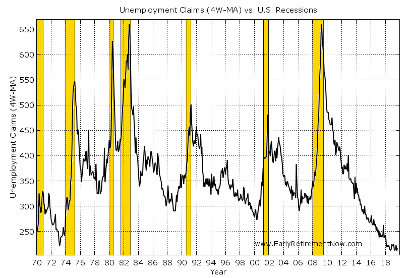
2: Unemployment Claims (Grade: A-!)
The weekly unemployment claims still look really, really solid. They have been stuck close to a multi-decade low and even all-time low when calculated as the ratio of unemployment claims the overall size of the labor market. So, by this measure, it still appears that we’re long ways away from a recession. To even start getting worried about a recession I’d need to see a rise by 50k or even 100k in the unemployment claims.

3: The Manufacturing Purchasing Managers Index (Grade D+!)
The PMI has weakened quite noticeably since I wrote my last update. We used to be in the high-50s, even above 60 when I first wrote about this topic. Now we just dipped below 50, which is indeed in “contraction” territory, meaning that the share of Purchasing Managers surveyed with a negative outlook exceeds that with a positive outlook.


How far below 50 should we drop to get really nervous? In the past, recessions mostly correlated with a drop below 45. A mere fall below to slightly below 50 is mostly consistent with a false alarm. But again, don’t get me wrong: every fall below 45 also started with a drop below 50. This is the indicator I’m the most nervous about right now!


What if you follow hundreds of macro indicators?
One legitimate criticism is that with just three indicators we don’t get a really comprehensive picture. True! But I don’t have the time to collect, process, monitor, and interpret all the different macro indicators that come out regularly. What can you do if you want to understand the impact of all those different indicators (literally hundreds!) on the health of the macroeconomy? Two great resources for that are easily accessible on the web:
- The Federal Reserve Bank of New York: Nowcasting Model. The current, third-quarter GDP forecast is 1.6%. The one-quarter-ahead projection is even weaker, at 1.1% (though with very large error bands!).
- The Federal Reserve Bank of Atlanta (my former employer!): GDP NOW model. The current estimate of the 2019 third-quarter GDP growth is at 1.8% (as of Sep 11, next update Sep 18).
What I like about the “nowcasting” approach is that you are less likely to fall into the “confirmation bias” trap, where you cherrypick certain indicators that confirm your preset notion of what you want to find while ignoring all the other information. You simply look at all indicators and build a model for determining how each one of them marginally impacts your forecast target.


So, these underwhelming growth numbers are largely consistent with my “poor man’s” version three-indicator model. The growth rates under 2% (I’d call that a letter grade C) could certainly look like the late expansion growth rates right before the economy keels over and goes into recession. They also look like the many other temporary weak spots, e.g. 1995 or the numerous false alarms post-2009, where everybody ran around with their hair on fire (fire, not FIRE). But they never turned into anything even close to a recession.
What does that all mean?
So, again, the grades for my three indicators:
- Yield Curve: C-
- Unemployment Claims: A-
- PMI: D+
That would make the average grade still a C or even C+. Not pretty but still a passing grade. It looks like an economy that’s muddling through a soft patch. But this “mixed bag” of indicators also means that the degree of uncertainty has gone up. So, the probability of a recession has certainly gone up! You take a bell curve and shift it to the left and increase the standard deviation (dispersion) and the probability for left-tail events will go up. It’s simple math! But while the probability of a recession certainly increased, it’s nowhere near 100%! But it’s on my radar screen now!


Conclusion
Of course, I’ve planned conservatively enough that even with a recession and a bear market, my early retirement withdrawal rate should be safe. Should! But it doesn’t mean that I would derive a lot of pleasure trying out how my plan works out in the worst-case scenario. It’s a bit like a SWAT Team; despite wearing all sorts of fancy gear, bullet-proof vest, etc., they still wouldn’t like being shot at! So, despite all the safety margins, the prospect of a recession would indeed make me a bit nervous and, therefore, it’s natural for me to follow what’s going on in the economy and the markets. And following the economy, I want to be neither this guy – panicked all the time:


… nor this guy – never worried because he’s resistant to any data coming in:


The best approach is to look at the data with an open mind and some level of consistency. So, I’ll keep writing about this stuff here, especially if my view changes! Stay tuned!
Hope you enjoyed today’s post. Looking forward to your comments and suggestions below
Title Picture Source: Pixabay.com