


Welcome back to the Safe Withdrawal Rate series. 13 installments already! As requested by many readers, both in the comments section and via email, I wanted to look into one intriguing method, called “Prime Harvesting” (PH) to dynamically shift the stock vs. bond allocation during retirement. Where does this post fit into the big picture? Recall that parts 1-8 of our series dealt with fixed withdrawals and fixed asset allocation (same % stocks and bonds throughout retirement). Make sure you check out our SSRN working paper, now downloaded over 1,000 times!
Parts 9-11 dealt with how to adjust the withdrawal amounts while keeping the asset allocation fixed (Guyton-Klinger, VPW, CAPE-based rules, etc.). Prime Harvesting does something completely different: Keep the withdrawal amount constant, but use a dynamic stock/bond asset allocation to (hopefully) squeeze out some extra withdrawal wiggle room; the Northwest corner in the diagram below. Almost uncharted territory in our series!


Eventually, of course, we like to move to that Northeast corner: Dynamic withdrawals and Dynamic Asset Allocation. But let’s take it one step at a time! Let’s see what this Prime Harvesting is all about.
Let’s get cranking!
Basic McClung Prime Harvesting Rules
- This rule was proposed by Michael McClung in his book Living Off Your Money (paid link).
- Pick an initial asset allocation, e.g., 60% Stocks, 40% Bonds.
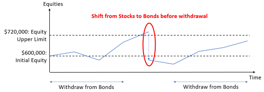
- There is an upper “guardrail” for the stock portfolio. You never withdraw from the stock portfolio until you reach that upper guardrail of equity holdings (and the guardrail is adjusted for CPI inflation). Normally that guardrail is set to 1.2 times the original equity holdings.
- If stocks are at or above 1.2-times their initial level (adjusted for inflation) then sell 20% of stocks and shift into bonds.
- Sell from bonds to fund upcoming withdrawal. If no more bonds are available then sell stocks.
- That’s it. It’s really that easy!

Why this works
Prime Harvesting has the tendency to first liquidate bonds and let equity gains run for a while before withdrawing. If you have the bad luck of an equity drawdown early during retirement (sequence of return risk!) you avoid selling stocks at the bottom and first live off the bond portfolio until equities recover. Smart move!
You could potentially get lower sustainable withdrawal rates if equities have a very long and sustained bull market (1991-2000) and you start liquidating equities too early by consistently breaching the upper guardrail. But that’s when you least worry about suffering a slightly smaller safe withdrawal rate: 7% or 8%, who cares? PH helps you when you need it the most: when the fixed withdrawal method only sustains a sub-4% withdrawal rate. Of course, the idea isn’t new. Wade Pfau and Kitces have a paper on this exact topic: Why you want a rising (!) equity glide path in retirement. I wrote about the idea of rising glidepaths in Part 19 and Part 20 of this series.
Here are a few things that we don’t like about this approach:
- The analysis is done annually in the McClung book. We don’t like to withdraw an entire year’s worth of living expenses all at once, so we want our simulations to run monthly rather than annually. The simulations also have to be consistent and comparable with our other simulations!
- The equity rebalancing rule in its proposed form sounds a bit nonsensical. Imagine you start with a million dollar portfolio, $600k in stocks, $400k in bonds. The upper limit for stocks is $720k. Imagine you’re at $719,999. You do nothing. Just one additional dollar and you’d sell a huge pile of $144k worth of stocks and bring the equity holdings to below (!) the initial level. That seems a bit excessive. I found that a more sensible way would be to shift down to $600k (=> reduce by 20% of the original equity weight). Maybe the explanation in the book wasn’t entirely clear and this is what McClung meant. Whatever his intention, this is what I use as the McClung rule.
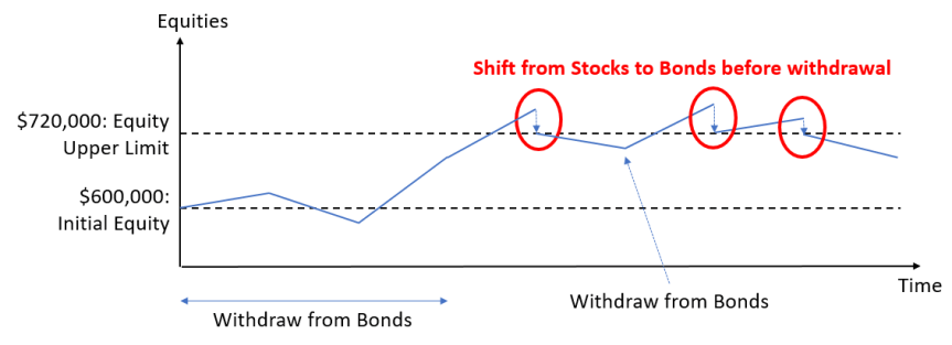
- Even that modified McClung rule creates some pretty nonsensical outcomes, more details below. Instead of selling a lot of equities all at once after breaching the upper guardrail, I also propose a new version, McClung-Smooth, where we sell only enough equities to bring the equity holdings back to the upper guardrail.

Let’s see how the PH methodology would have performed when applied to some of the “trouble-maker” retirement cohorts.
Case Study: 1966
- Monthly Simulations: January 1966 – December 1995 (360 months)
- Pick one initial withdrawal rate (in % of initial portfolio), and adjust the withdrawal amounts by the CPI index regardless of portfolio performance.
- Initial portfolio: 60% stocks, 40% bonds.
- Target capital preservation, so the final portfolio value is the same as the initial, adjusted for inflation after 30 years. Recall that my wife, Mrs. ERN, will be 64 after 30 years of early retirement so I would prefer to preserve capital for at least 30 years.
- The guardrail is 1.2 times the initial value, adjusted for inflation every month.
The asset allocation rules we consider:
- McClung: after breaching the upper guardrail, sell 20% worth of equities of the original, inflation-adjusted equity holdings, e.g., with a $1,000,000 portfolio shift $120,000 (adjusted for inflation) of the equity portfolio into bonds.
- McClung-smooth: after breaching the upper guardrail sell enough stocks to bring the equity holdings back to the guardrail.
- Forced bond liquidation: Same as above, but with an infinite equity guardrail. This has the effect of never shifting from stocks to bonds, i.e., we live off the bond portfolio (principal + interest) until bonds are exhausted and then just maintain a 100% stock portfolio.
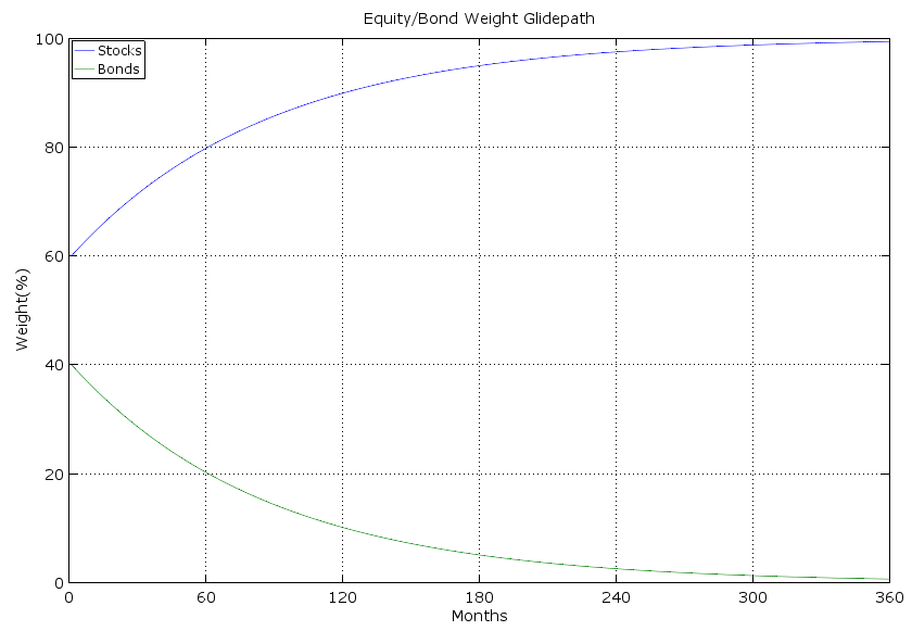
- Glidepath: We shift to a to a 100% stock, 0% bond portfolio. From a 60/40 portfolio, we steadily converge to a 100/0 portfolio.
- Fixed: We keep a fixed 60/40 allocation.

Results:
First, let’s look at the maximum sustainable withdrawal rates that guarantee capital preservation:
- McClung: 3.038%
- McClung-Smooth: 3.071%
- Forced Bond Liquidation: 3.069%
- Glide Path: 3.061%
- Fixed Withdrawal Rate: 2.815%
Nice! With a rising equity glidepath, we beat the low fixed withdrawal rate. But don’t get your hopes up too high. We are talking about a 0.2% difference, $2,000 p.a. in a $1,000,000 portfolio. Not that McClung ever claimed otherwise, but the advantage of the PH method is small. But it is consistent, i.e., we never found a retirement cohort where the fixed SWR was below 4% and the PH method hurt you.
How does the McClung experience look like over time for this cohort? In the chart below we plot the time series of stock and bond levels (top chart, scaled to initial portfolio value of 1.0) and stock and bond portfolio shares as a percent of the overall portfolio. 1966 was a very challenging year. You slowly erode your bonds over about 12 years and then live off the pretty badly decimated stock portfolio. Only when equities recover in the 1980s would you start replenishing the bond portfolio in the late 1980s and early 1990. Notice the four big distinct and discrete jumps in bonds!


The smooth McClung method is exactly identical to the above chart until 1987 because it never hit the upper guardrail for two decades. The shift into bonds is a little bit more gradual. Equities hover around the 0.72 mark for most of the remaining years of the simulation horizon and all the gains above that mark are skimmed off into the bond portfolio. It’s no wonder that the smooth McClung method performs a little bit better than the original McClung method; you keep a higher average equity portfolio during the stock market heydays of the late 1980s and mid-1990s.


Yet another scenario, the forced bond liquidation never moves back into bonds in 1987. Despite the crash in October 1987, you achieve capital preservation with a withdrawal rate not too different from the smooth McClung method.


Something fishy going on with McClung?
Working on this research project, I noticed something odd. Below I plot the final value of the portfolio as a function of the withdrawal rate for both the McClung and McClung-Smooth allocation rules. Each tick mark is 0.001% (that’s only $10 annual withdrawal in a $1,000,000 portfolio). For the original McClung, the final value is non-monotone (!) in the withdrawal rate. There are several occasions where the sustainable withdrawal rate moves up (!) when you increase the withdrawal rate. But there are also cases where the final value plummets by a significant amount by merely increasing the initial withdrawal amount by one tick mark. How is that possible? It has to do with the discrete shift out of equities and into bonds as mandated by McClung.


So imagine with a 3.010% withdrawal rate we reach $719,999.99 by a certain month. With a 3.009% withdrawal rate, we’d have reached just a few dollars above $720,000. What if we shifted the $120,000 out of equities, as mandated by McClung, right before another big blockbuster month in equities? It’s possible that we might shift out of equities exactly at the wrong time and end up with a lower final value despite a lower withdrawal rate. But “Natura non facit saltus” which is why we prefer our smooth McClung version (the green line). Thus, as much as I like the spirit of the McClung procedure, the implementation as recommended in his book is unacceptable. You should not get a final value that’s not monotonically decreasing in the withdrawal rate. And, likewise, a change of 0.001% in the initial withdrawal rate making a difference of 5%+ in the final portfolio value is preposterous. This would imply that in a $1m portfolio, a change of $10 in the initial annual withdrawal amount would translate into a $50,000 difference in the final value.
Other cohorts
Let’s compare the safe withdrawal rules of other cohorts as well. January 2000 would have been another bad retirement date. To preserve the capital over the next 17 years, a fixed withdrawal amount, adjusted for CPI, would have sustained only a 2.652% initial rate. Again, the McClung-style rules would have outperformed that rate. Quite intriguingly, the glidepath performed the best. Though, the differences are all very small!
Starting retirement at the market peak in October 2007, the fixed withdrawal rate would have supported an initial SWR of just under 4%. McClung again beats this by about 0.20%, but the McClung-Smooth procedure again does better than the regular McClung. Quite intriguingly, the forced bond liquidation and the glidepath beat both of the McClung rules by a very substantial margin.


An important caveat
Let’s look at the chart of equity/bond holdings/percentages for the January 2000 retirement cohort using the McClung-smooth rule. The SWR is only 2.742%. But notice how this retiree never even touched the equity portfolio until 2014. How can a $400k bond portfolio sustain $27,420 p.a. in withdrawals for 14 years and be only half depleted by 2014? That’s a withdrawal rate of 6.855% out of the bond portfolio plus inflation adjustment! We never depleted the fixed income portfolio because bonds did phenomenally well during that period. Yields started at over 6%, then yields went down due to Fed policy (lower target rate, quantitative easing, etc.) and brought large capital gains in bonds. What are the odds we’ll have another bond bull market going forward? Slim to none. Current yields on 10-year Treasury bonds are only slightly above 2%, so average bond returns over the next 14 years can’t possibly match the return of the 2000-2014 period. So the caveat here: Prime Harvesting works best if bonds do well. But that may not be the case over the next few years!


Conclusion
Prime Harvesting is an intuitive method to dynamically shift the stock/bond allocation in retirement. In the past, it would have sustained slightly higher withdrawal rates than the fixed percentage rule when it mattered the most: when stocks did poorly right after retirement. We propose one improvement to this methodology; use a smoother version that avoids selling massive amounts of equities all at once. Letting equities rest at the upper guardrail and skimming only the excess equity wealth above the guardrail seems to be a more sensible approach. It not only avoids the discontinuities and jumps in the final asset value chart above but also tends to afford slightly higher SWRs.
In some of the simulations, we found that just a naive glidepath toward higher equity percentages beats even the more complicated McClung procedure. But that comes at a price: Do people really have the appetite for 100% equities later in retirement?
We are particularly interested in how the Prime Harvesting rule will interact with dynamic withdrawal amounts. That’s because in retirement we’d not even be very interested in increasing our withdrawals if the market does well. Instead of buying more consumption (who wants that, we’re all frugal around here, right?) we’d probably prefer to “buy more safety” by de-risking the portfolio and shifting into bonds instead. Prime Harvesting would be a good tool to achieve that. But as always, in 2,000 words or so we can only scratch the surface. We are planning more installments of this series, so check this space for more research on this topic!
Thanks for stopping by today! Please leave your comments and suggestions below! Also, make sure you check out the other parts of the series, see here for a guide to the different parts so far!
Picture source: pixabay.com