
Update: We posted the results from parts 1 through 8 as a Social Science Research Network (SSRN) working paper in pdf format:
Safe Withdrawal Rates: A Guide for Early Retirees (SSRN WP#2920322)
Welcome back to our safe withdrawal rate series! Over the last two weeks, we already posted part 1 (intro and pitfalls of going beyond a 30-year horizon) and part 2 (capital preservation vs. capital depletion). Today’s post deals with yet another early retirement pet peeve: safe withdrawal rates are likely overestimated given today’s expensive equity valuations. We wrote a similar piece about this issue before, but that was based on cFIREsim external simulation data. We prefer to run our own simulations to be able to dig much deeper into this issue.
So, the point we like to make today is that looking at long-term average equity returns to compute safe withdrawal rates might overstate the success probabilities considering that today’s equity valuations are much less attractive than the average during the 1926-current period (Trinity Study) and/or the period going back to 1871 that we use in our SWR study.
Thus, following the Trinity Study too religiously and ignoring equity valuations is a little bit like traveling to Minneapolis, MN and dressing for the average annual temperature (55F high and 37F low, see source, which is 13 and 3 degrees Celsius, respectively). That may work out just fine in April and October when the average temperature is indeed pretty close to that annual average. But if we already know that we’ll visit in January and wear only long sleeves and a light jacket we should be prepared to freeze our butt off because the average low is 8F =-13C! Likewise, be prepared to work with lower withdrawal rates considering that we’re now 7+ years into the post-GFC-recovery with pretty lofty equity valuations.
How do we account for today’s equity valuations? Very simple, we run our simulations and then compute success probabilities, not just averaging over all observations but we also bucket the over 1,700 possible retirement start dates in our study by how cheap or expensive equities were at the time. We’ll do so by looking at the well-known CAPE Ratio.
A quick CAPE ratio primer
The measure for equity valuation we use is the CAPE ratio. We are all familiar with the PE ratio. Price divided by earnings measures how much you’re paying per dollar of the current annual earnings (normally a four-quarter trailing E, though PE ratios based on estimates of future earnings are common, too). This is done both on the individual equity level, but also for an index, e.g., the S&P500.
Robert Shiller, who is one of the 2013 economics Nobel Prize winners, introduced another interesting concept: The cyclically-adjusted price earnings (CAPE) ratio (see free data on Shiller’s site). It divides today’s index level by a 10-year rolling average of real (CPI-adjusted) earnings. Think of it as the average real earnings over an entire business cycle. Shiller found that the usual PE ratio is a bit too noisy; remember, you divide two highly volatile series P and E. However, making the E portion of the PE less volatile apparently gives you a sharper predictor of future returns.
The median CAPE ratio is just about 15. Which is quite intriguing because if we were to invert that number 1/15=0.0667=6.67% (= CAEY = cyclically-adjusted earnings yield) we’d land almost exactly at the long-term average real equity return of around 6.6% (see more details here). That’s more than a coincidence because the real return on the index should roughly equal the average real earnings yield in the index. Since 1871, the CAPE was anywhere between 5 when stocks are really cheap at or near the bottom of recessions/bear markets to over 40 at the height of the dot-com bubble. And most importantly:
The Shiller CAPE is correlated with future equity returns
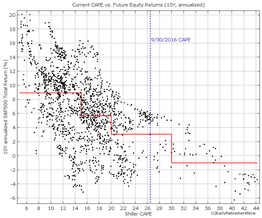
That’s right, today’s CAPE ratio is pretty good at predicting future equity returns. Well, not perfectly but there seems to be a strong and statistically significant inverse relationship between the CAPE and forward-looking equity returns, see chart below where we plot the CAPE ratio versus the subsequent 10-year annualized S&P500 return. For something as ostensibly unpredictable as stock returns, this is truly amazing. Equity returns are not exactly a random-walk! If we split the CAPE into four regions we get pretty different average equity returns by bin:
- CAPE below 15 (below the median): Average equity return of 9% real (!)
- CAPE slightly elevated (15-20): Average equity return just under 6%, still very solid returns that will likely support a 4% safe withdrawal rate.
- CAPE moderately elevated (20-30): Only about 3% real return (!) going forward. Today’s CAPE falls into this range. The 9/30/2016 level was at just under 27, and after the recent rally, it’s even a bit above 27.
- CAPE severely elevated (30+): A below -1% real return over the next ten years. Bummer! Good luck starting your retirement in that environment!
Simulation results
Let’s look at the Success rates over 30-year (top panel) and 60-year horizons (bottom panel). The charts have the familiar format you might remember from before, plotting the success rates as a function of the portfolio equity share (rest invested in 10Y Treasury Bonds). In this chart, each line corresponds to the success rate of a different CAPE regime at the beginning of retirement.

Quite intriguingly, over the 30-year horizon (top panel) and for equity weights greater than 40%, every single failure of the 4% rule occurred when the CAPE was above 15 at the start of retirement. In contrast, for all CAPE<15 you have a 100% success rate. You get close to a 100% success rate with a 75+% equity portion and the CAPE<20. I wish the original authors of the Trinity Study had dug deeper into when those failures occur.
Also, did we mention that a 30-year horizon is an entirely different animal from a 60-year horizon? Oh, yeah, we pointed that out before, but to state the obvious, success probabilities are much, much lower over the longer horizon.
Anyway, the current CAPE of 27 falls smack into the 20-30 region represented by the yellow line. At a 60-year horizon with capital depletion, we are now looking at a 72% success rate with 100% equities (much lower than the 89% success rate over 30 years). Quite amazingly, lowering your equity share in response to expensive equity valuations will actually lower (!) your success probability. How crazy is that? True, for a seriously overvalued equity market (CAPE above 30) you do get a bit of a hump-shaped curve (see the maroon line in the bottom panel) with a sweet spot between 70 and 80% equity weight (same is true for the 30-year horizon with both the 20-30 CAPE and 30+ CAPE). But for the other three lines in the bottom chart, including the yellow line representing today’s regime, we see that the success probability is solidly increasing monotonically in the equity weight. Equities rule when you’re looking at a 60-year horizon! Again: due to the long horizon, investing in equities is the way to go even if they are overvalued in the short-term. Bonds with a 2.6% long-term real return just threaten your long-term sustainability as we mentioned here. (Of course, one solution would be to have a higher bond share only until equities return to a CAPE<20 and then increase the equity share again. But we haven’t calculated that yet.)
Higher final value target
As we stated previously, a zero final asset value is not acceptable to us due to our strong desire to leave a bequest. As expected, once we target a higher than zero final asset value, the success probabilities diminish even more, as we pointed out previously. Below are the charts for targeting a 50% final asset value target.

Now even the CAPE regimes of below 15 or 15-20 no longer guarantee success over a 60-year horizon (or even a 30-year horizon for that matter). Bummer! The only good news is that the higher final asset target only lowers the success probability to 71%, from 72% (bottom chart, yellow line, 100% equities).
Let’s lower the SWR to 3.5%
Lowering the withdrawal rate to 3.5% should improve the success rates, as we pointed out last week: at 100% equity share we had a 96% success probability preserving 50% of the final value after 60 years. That rate goes down to 88% when the CAPE ratio is between 20 and 30. Of course, for CAPE values below 20, the 100% equity portfolio had a 100% success rate, both over 30 and 60-year horizons. Nice to know, but again, today’s CAPE is at 27. For me personally, a 12% failure probability is still a bit too high.

How about 3.25%?
To insulate ourselves from running out of money we likely have to lower the SWR all the way to 3.25%. Now we can get all the way to 97% success probability with 100% equities and even close to 100% with an equity share of 80-90%, see chart below.

I wouldn’t want to get my hopes too high about the benefits of bonds, though. Despite the recent rally in bond yields (and the resulting pummeling of bond prices) since November 8, yields are still extremely low by historical standards. For example at 2% annual inflation and around 2.5-2.6% yield for the 10Y Treasury Bond, we are looking at 0.5-0.6% real yield. Much less than the average 2.6% real return!
Update (2/7/2022): As suggested by reader AndyG42, I should point out that over the years, my views on the 100% equity portfolio have evolved. It’s certainly true that the probability of failure is small but if you like to eliminate the chance of a failure in past historical cohorts, you’re better off with a lower-than-100% equity weight, likely somewhere around 70-80%.
Conclusion
We face a triple-whammy of bad news when it comes to safe withdrawal rates and using the Trinity Study data for our purposes:
- We have a longer retirement horizon. My wife will be in her mid-30s when we retire and her family seems to have a longevity gene. We like the money to last until my wife is at least in her mid-90s. We face a 60-year retirement horizon, twice the longest horizon the Trinity Study considers.
- We like to leave a bequest
- Today’s equity expected returns could be low due to the current sky-high equity valuations
All of that does not bode well for the 4% rule. To push failure rates of the withdrawal strategy to a low enough level, we’d likely have to lower the SWR to 3.25%.
Quite intriguingly, bonds don’t offer much benefit for the success rates, unless stocks are wildly overvalued, with much higher CAPE ratios than today’s value (>30!). For CAPE ratios below 30, mixing in bonds has either only a marginal benefit or even lowers the success probability.
What we learned so far: The Trinity Study and many in the FIRE crowd seem to recommend a generous withdrawal rate and conservative stock vs. bond allocation. But with a 4% SWR and 70-80% equity weight you have a roughly 1 in 3 chance of wiping out your money after 60 years. We want to do the opposite: A conservative withdrawal rate (e.g. 3.25%) and a generous equity weight (e.g. 100%). Who would have thought!?
Thank you very much for providing this analysis. Very helpful!
Glad you liked it. Best of luck!
Interesting analysis ! certainly now that CAPE hovers around 32. Have you considered developing a possible portfolio design strategy using CAPE as trigger ? for example, you could devise a strategy that upon CAPE reaching 30, no new cash is invested in stocks and no dividends are reinvested in order to build up a reserve; upon CAPE reaching 35, you actually start trimming positions; upon CAPE dropping below 30, new cash and dividends are again reinvested; upon CAPE 25 you start also investing the reserves created when CAPE was above 30, etc. You could play a bit with the exact trigger points, but I would think that this will lower volatility in the long run and generate a higher return
Timing out of the market as a function of the CAPE is notoriously unsuccessful. You would have missed a large chunk of the late-90s rally.
The CAPE might work better timing the entry back into the market…
Firstly, thanks for the incredibly detailed write-ups. They are a pleasure to read.
How do the success rates for 3.25% SWR and FV = 100% look?
I would assume because the 4% SWR and FV = 0% and the 4% SWR and FV = 50% look pretty similar that the 3.25% SWR and FV = 100% success rate is very close to the 3.25% SWR and FV = 50% plots.
Well, you got the Google sheet, try it out. I get the following work stats for 1929:
Time Worked 225m 18.75y
First Month 14m 1.17y
Last Month 264m 22.00y
Still a long work history. Even though with a SWR of 3.25% it wasn’t even necessary!
Hey ERN,
Thanks a ton for doing this series. I’m only a few posts in but this is super insightful!
One thing I don’t quite understand is why the success rate for 30Y time horizons with CAPE >= 30 starts out at 100% for all equity weights between 0 and 70%. Is it a plotting error? Or are bond returns that good in the 30-years following high CAPE valuations, historically? It doesn’t make much sense to me, I would expect the line to be around or below the lower CAPE valuations.
For the 60-year horizon plots, the CAPE >= 30 data seems a lot more plausible.
It’s legit! The CAPE>=30 is the period right around the Dot-Com bubble. Bonds had a fantastic run since 2000. Even when extrapolating the bond returns 2018 and forward with a 0% real return you’ll still have a very high success rate even with an all-bond portfolio!
This is really troubling me too. Intuitively you would think starting your retirement at high CAPE (over 30) would have lower success rates than starting out in a lower CAPE but these charts all show high CAPE is super and the best time to retire.
It’s what’s in the data. But we’d be fools to extrapolate this and predict a repeat for today’s CAPE>30! Bonds yields are much lower today than in 2000, so you have less room for strong bond returns today than you had in the late 1990s, early 2000s!
First, absolut fantastic content here on this Blog! Thank you so much for that! 🙂
Second: If you have a low equity rate on your portfolio you will run out of money in the long term, anyway. the valuation of the stocks and bonds doesn’t matter, because in this case you have not enough return. So, at the beginning of your retirement it may be the right strategy to have a low equity rate for your portfolio(high valuation) , but after the “crash” or bear market it is absolutely the wrong strategy, specially in the long term. If you look at a 30 year old chart of the S&P 500 you can’t even see some bear markets, because it’s so small in the chart. The calculation of ERN expects, that the equity rate stays the same over 60 years. I mean 60 years. This so such a long time and I think this is not a realistic fiction.
In my opinion the calculation tells us, Timing is quite important. And you should modify your equity rate by looking on the cape and other indicators. I would love to see a calculation, which includes modified equity rates based on the cape. Sadly I don’t have the skills, but I learn every day more on that and I let you know when I finished that, or maybe anyone in this community calculate that.
Hi 🙂
Do I understand correctly, that final value of 100% is the initial value?
So, if we invest 1 000 000, after 60 years of inflation it will be worth like 200 000 or so in today’s money (depending of course on the inflation size).
Since you keep mentioning that you want to leave some inheritance, I expected the final value to mean original amount plus inflation.
Thank you for doing thorough analysis 🙂
Good question. Unless otherwise stated, 100% final value target always means adjusted for inflation. So, if you start with $1m then the final value target is $1m plus inflation adjustment, which is likely much above than initial nominal value!
Thank you for the answer. It makes more sense now 🙂
For other readers, I stay up to date on the current CAPE on the site multpl. Google Shiller 10. I believe it’s only for the SP500. You’ll notice it’s been a particularly crappy couple of decades for investing haha. But times always change.
Thanks for the link!
Hi ERN, it might be interesting to run a SWR simulation that starts with the high cape poor return 15-year period of 1966 to 1981. Then graft on to it a second 15 period of the same poor returns and alternately a second 15 year period of a disappointing mean reversion, say avg 2 or 3% pa. See the success rates for various SWRs. This would stress test things and give a worst case scenario.
Well the CAPE was more than cut in half between 1966 and 1981 (From 20+ to single-digits), I doubt there’s a scenario where it would have gone from 9 to less than 5.
You can certainly hack the returns 1981-1996 to replicate the the same returns as 1966-1981 and push the SWR to below 2% but even I have to concede that this would be too pessimistic. 🙂
I have a basic background in the kind of SWR work that has been done (articles I have read in the _AAII Journal_ and _Financial Planning_ over the years), but judging from the comments it seems like this [series] is truly exceptional.
Having said that, I worry about three things that might really compromise what we can make of this. Perhaps you can tell me “it’s no big deal.”
First, as Zachary Neilson pointed out, the CAPE cutoffs are determined in retrospect. Starting 30 or 60 years ago, you have no idea what the range will be and therefore could never come up with baskets. This is a future leak.
Second, I would question the sample size of each bucket (e.g. CAPE < 15, 15 < CAPE <= 20, 20 < CAPE 30). If we don’t have large sample sizes in each then isn’t that a problem statistically? Also, are the occurrences in each bucket scattered across a large sample size of time points or are they clustered around a small number?
What statistical background I have does project large red flags because of these last two paragraphs. I get the impression that this is how research in the field is done and you have taken a brilliant step forward by not just settling for being non-negative at t-prime. Still, though, I wonder if–at worst–these concerns render all of this meaningless. Just because it “has been done” doesn’t make it right or even meaningful. I’m interested to hear your thoughts on the limits of practical application.
Finally, I think it was in part 2 where you made a really keen insight. You mentioned that while you have run many of these simulations with “success” defined as staying above X% FV, what was not done was testing whether net worth ever fell below X% during the period. Indeed, this is exactly what causes people to pull out of stocks–often at the worst time. To what extent does this compromise the integrity of the conclusions?
We could also make this less susceptible to “look ahead bias” by splitting the months into above/below median CAPE value UP TO THAT POINT, i.e., not with fixed values that were chosen with the knowledge of the entire CAPE time series.
And without in-sample-bias you’d get very similar results. So, this is not really such a big deal.
Thanks for this very helpful series, ERN!
Question: for CAPE>30, don’t the only 30- and 60-year follow-up periods date from 1929? I saw your response to DVK above, where it sounds like the dot.com bubble period is included in the data. How are you calculating 30- and 60-year returns following that time period?
(If you’ve explained this elsewhere, just point me to it.)
& Merry Christmas!
True. CAPE>30 happened only twice: 1929 and around 2000. For 2000 you’d need to assume a mean rate of return post-2019 to complete your 30 and 60-year window. See Part 1 of the series for details. 🙂
Big ERN, one thing I’ve been wondering about re: high CAPE….. Is there any chance that the current >30 landscape and high overall costs for stocks is simply a new norm, reflective of the huge increases in quantities of dollars (and investors) buying mutual funds to fund retirements? Given that pensions are mostly gone by the wayside (other than government work, military, and social security), increasing numbers of people are flocking to buy stock mutual funds—far more than in ages past. Might this higher demand somewhat permanently lead to higher CAPE than we’ve historically seen, and therefore might 30+ not be quite as big a precursor of disaster as it was previously?
It might as well be, though I’d be very cautious because that “new norm” argument is what people floated right before the 1929 crash.
If I hear any famous economist making that point again now, we should all be very worried!!! 🙂
Since I’m 64 and my portfolio has reached my number that allows me to be able to retire if I want to, in other words, I’ve won the game, my portfolio is currently 25% equity / 75% fixed income-cash for caution due to high CAPE environment. Using the CAPE withdrawal rate formula, would withdraw ~ 3.0% if I retired now.
In the next year or two, I will start the portfolio on an accelerated rising equity glidepath transition to reach 55% or 60% equity in 10 years or so.
That would be a great low-risk approach to withdrawals! Best of luck! 🙂
Big ERN,
Your body of work on SWR is incredible and extraordinarily valuable to everyone..The Google doc model alone is priceless. It must truly be a labor of love. For all that you do and contribute, THANK YOU.
I do have one concern that I would like to hear your view. All of the historical data (and the basis for the MC simulations) is based on US returns for the past 100 +/- years. The data set is robust.
However, the last 150 years have transformed human existence. Broadly, I believe the root causes are
1. scientific and mathematical knowledge
2. organized capital markets
3. human freedom and property rights.
And the US has been the transcendent economy during this time and the most powerful economic force in human history. Certainly, no other economy or capital market was its equal during this period. Number 1 (knowledge) should continue into the future (although the US may no longer be the leader), and 2 and 3 now already exist.
My concern – is only using US historical data systematically biased? And is the bias overstating the ROI creating risk for those who rely on the historical returns to continue?
Thanks for all you contribute,
Patientcash
Thanks. Excellent point! It’s a concern. If you look at 150-year return sequences in many other countries (Japan, Germany, Netherlands, etc.) you’d have been wiped out somewhere in between. We were very lucky in the U.S.
But other countries (Canada, Australia, etc.) also have a long history of peaceful economic expansion, i.e., never wiped out in a war, never overrun by another country.
So, take all simulations with a grain of salt. The outcome could be better (if AI takes over and makes capital really valuable) or it could be worse if we have long economic slowdown, war, etc.
Hi,
Amazing reading. I love all your articles!
In April 2021, the S&P500 is almost at 4100. The CAPE is about 35. Is it still safe for one who want to make sure not to run out of money and still rely only his nest to last 50 years, to use the multiplication? You mention that if you do have 30x, you should be fine. Lets say I have 35X my current annual needs and that is not accounting for income tax. The 35X is based on this high valuation market ,so I’m not sure how accurate is the valuation of this number. Will it still be safe if the market goes in a big correct like in 1966/2000 or 2008? Or worse if we live another lost decade?
What would be the safe multiplication for these scenarios?
Depends on your horizon and your spending pattern. But 35x means SWR<3% and that would have been safe even with the 50-60 year horizon and even in the most unfortunate historical cohorts (1929, 1966).
Thanks for the answer. My goal is to stop in about a year from now. I do have currently between 35-40x of my budgeted future annual requirement before tax and fees. However, I don’t know if that is the right way to look at this. I do have >35x But I am very concerned with the current valuations as this is today’s number based on current market. Is the 35x real or over inflated? I keep asking myself, What would be the number multiple in normal market?
What if we go through another lost decade in my beginning of my retirement, since the market is so hot now? I will most likely begin my retirement at the end of this bull market.
This makes me anxious as I have a hard time to find out if I have enough? I have been reading several of your articles and it was a great guide. But I still can figure out if I will be okay
There is reason to be anxious about the high valuations. Historical average is about 16. Now 37.
But It’s hard to time an impending meltdown with the CAPE alone. But if you calibrate your SWR low enough that it would have survived an equally overvalued market in the past, I believe you’re still safe.
Thanks for this wonderful series! I’m just digging in but it’s already helpful.
From everything I’ve ever read on blogs or Reddit, or heard in podcasts, I’ve been alone, surprisingly, in my method of what to do with extra cash once retirement accounts are maxed out. The great “invest vs. mortgage” debate. I’ve always had a gut feeling of investing when the markets are down, and paying extra on the mortgage when markets are up. I think the CAPE ratio you laid out is the metric I have been looking for to help me decide when to switch between the two.
I haven’t explored the rest of your site yet to see if you get into this. Does my method have merit, or is it something that just makes me feel better and is costing me in the long run?
Thanks! I can’t wait to get into the rest of your blog!
If you’re just starting out investing, I’d invest in the market, regardless of the CAPE. Hard to time the market crash.
Once, retired, I did some simulations (https://earlyretirementnow.com/2017/10/11/the-ultimate-guide-to-safe-withdrawal-rates-part-21-mortgage-in-retirement/) and I find the hedge against Sequence Risk (not to mention the peace of mind of a mortgage-free house) trumps the higher returns in the market.
hi, this is for your info: Just read about a study “Stocks for the Long Run? Evidence from a Broad Sample of Developed Markets” (https://papers.ssrn.com/sol3/papers.cfm?abstract_id=3594660). Investing outside USA results in a risk of up to 12% of loosing money even after 30 years.
You get high expected returns because you take sizeable risks! I’m not surprised! 🙂
Thanks for the link!
Hey Big Ern! long time reader and listener to any podcasts you put out. I’m working with your SWR Toolbox 2.0 – but as of the latest cape, we are 38+… I’m 53… would like to stop working around 55-59… would like to give you some numbers, but more privately.. if my numbers are interesting, you are welcome to a case study for your readers with my data… I keep reading this series and re-setting my goals (higher) to be sure I will be safe, but I just can’t seem to get that feeling of safety…
Let me know your questions or if you’re interested in sharing your thoughts and help boost my confidence. I’ll leave my email addy.
Steve (fellow washingtonian)
I don’t do any private counseling. If you find an error in the sheet or anything not making sense I can certainly take a look if you send me a link (privately). I can also give a quick 5-minute view of your situation. But I can’t guarantee anything beyond that. Otherwise I’d be working 60+ hours a week doing SWR analyses for readers. 🙂
I’m sitting here in January 2022 (Happy new year!) looking at the future annualised returns scattergraph here, which if I’m reading it correctly, shows that at CAPE 40 and over, as I think we’re about at now (?) we have never ever seen returns of higher than -2% p.a for the following 10 years.
In fact, it doesn’t even look like any of those regimes quite hit the heady heights of -2% p.a.
Not going to lie, big ERN, I find that a bit disturbing. Would you like to say some reassuring words? Is there even any meaningful analysis you can do for the CAPE regime of 40+ that’s severely above the ‘severely elevated’ level?
The only answer I can think of myself is ‘TINA’. Even then though, at this stage, I’m think I’m going to take the chance to rebalance relatively firmly. (no attempts at heroic all out/all in here, don’t worry).
Well, that experience is all based on one single episode: 2000. But it looks scary, doesn’t it?!
But to say something reassuring:
If the market deflates by 2% p.a. real over 10 years and then goes back to 6.5-7.0% real growth per year, maybe that’s not a huge risk to retirement. Depends on the path of equities during the 10 years. If it’s a slow decline everything will be OK.
I get so much out of this series I’m rereading it now.
I suggest you might want to add a small update/addendum to this one, as it strongly implies the right/safe answer for an early retiree is to usually be holding 100% equities. But generally elsewhere you don’t say something that extreme.
To the extent it’s arguing against intermediate and long term bonds, I surely agree with that – especially in today’s negative real interest rates environment. But as you argue persuasively and with data elsewhere, holding 100% equities when retired is hardly optimal given SORR.
Good point! I added a small section to explain how my views have evolved!
Very good work.